The great modernist designer Massimo Vignelli died today at age 83. A data geek before it was cool, he inspired a cult following with his corporate logos and stark typography. But his most famous design remains the 1972 New York City subway map, an artful take on one of the world’s most complicated public transportation systems. Vignelli’s map was retired in 1979 to make way for the current version, but it still inspires heated debate, not to mention wannabe transit cartographers who, like Vignelli, have dreamed of a map worthy of the system it attempts to demystify. Below are a few endeavors that never made it to the platform wall, but are lovely nonetheless.
Max Roberts, a psychologist and transit consultant who has worked with Transport of London, the agency that runs that city’s Underground, rendered New York’s subway as a series of commanding concentric circles.

Credit: Max Roberts
KickMap took the standard MTA subway map and elevated it with a vivid colorful background that emphasizes where different neighborhoods begin and end.
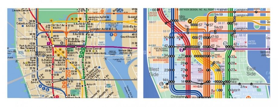
Credit: KickMap
Brooklyn-based design team Triboro took Vignelli’s classic and stripped it down to orange and white, leaving an arresting image that would catch the eye of even harried New York commuters.
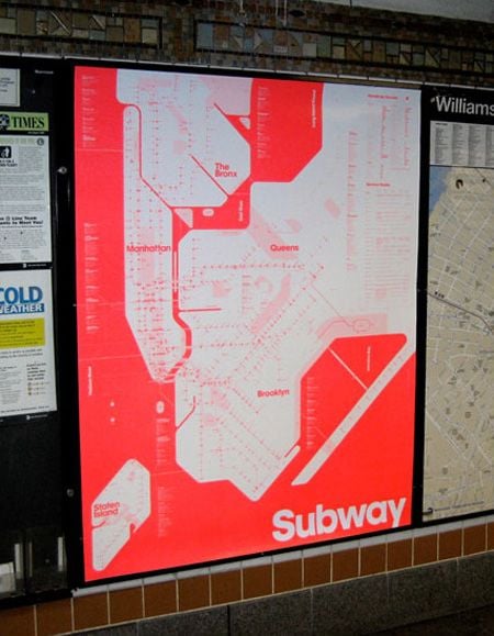
Credit: Triboro
This is a thing of both visual and audible beauty: the New York subway map as string instrument, using the actual train schedule to create the symphony.
Conductor: www.mta.me from Alexander Chen on Vimeo.
For “I Love NY” in map form, Seoul-based designers Zero Per Zero embeded New York’s transit system into a heart shape, rendering it cuddlier than it probably has a right to be.
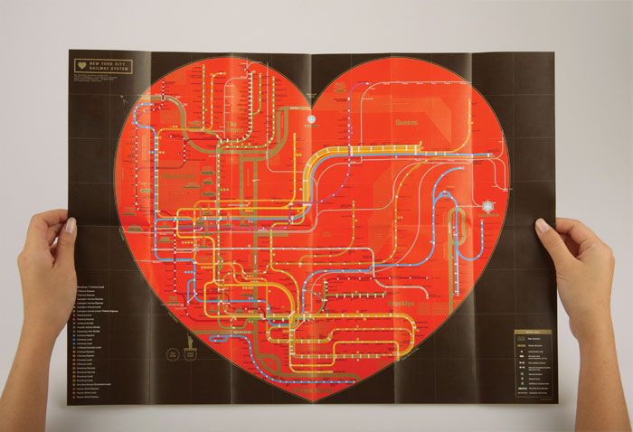
Credit: Zero Per Zero
In certain ways, this homage to the current subway map, designed by architect and mapmaker Jug Cerovic, is a lot cleaner and easier to read than the real one.
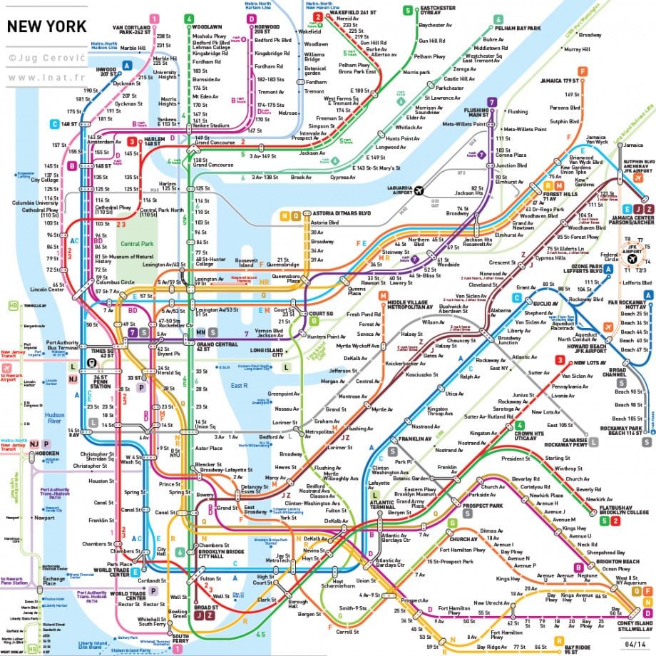
Credit: Jug Cerovic
When the current New York subway map was introduced in 1979, designer Nobu Siraisi quickly recognized what a mess it was around the Atlantic Avenue station in Brooklyn. So Siraisi redrew that section of the map by hand, in a sketch that never made it off the drawing board, but is somehow gorgeous in its simplicity.

Credit: Nobu Siraisi via Transit Maps

Will Doig was formerly Next City’s international editor. He's worked as a columnist at Salon, an editor at The Daily Beast, a lecturer at the New School, and a communications staffer at the Open Society Foundations. He is the author of High-Speed Empire: Chinese Expansion and the Future of Southeast Asia, published by Columbia Global Reports.


