The rich are richer, and the poor are poorer, and everyone lives in generally the same places they have for the last two decades.
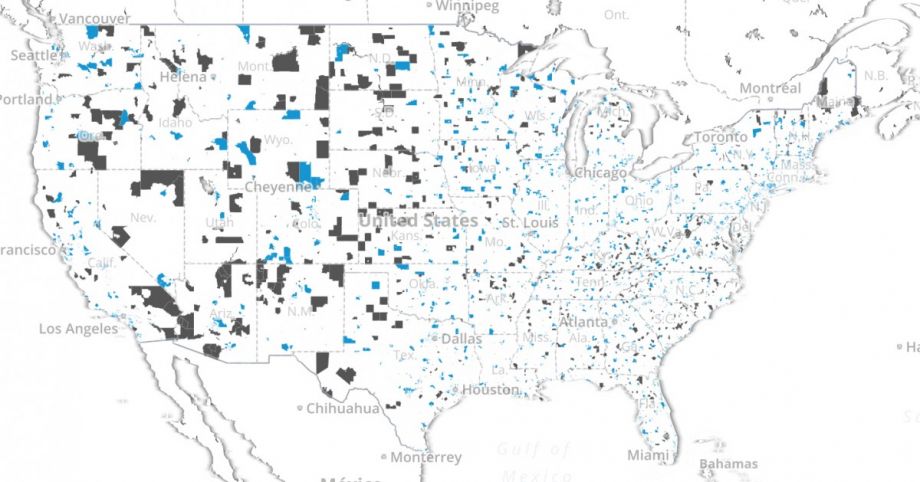
This takeaway from the Urban Institute’s “Worlds Apart” report, which analyzes 20 years of data from its Neighborhood Change Database, might not be all that shocking. But the Institute’s new interactive map offers an easy-to-read and troubling snapshot of American inequality, particularly as that sameness exacerbated the divide.
Keeping census tract boundaries constant from one decade to the next, 1990, 2000 and 2010, the researchers present a visualization of the evolution as economic conditions have changed. They used four indicators to group top and bottom tracts in their respective commuting zones: average household income, share of population with a college degree, the homeownership rate and median housing value. According to the report:
In 2010, the highest neighborhood advantage score was just over 4.30. The three most advantaged tracts in the United States are just outside Washington, D.C., with neighborhood advantage scores of 4.31, 4.20, and 4.19. The first tract in these areas, in Chevy Chase, Maryland, has an average household income of over $466,000 a year, and the other two, in neighboring Bethesda, have average annual incomes of $270,000 and $290,000. Their median housing values exceed $900,000. At least 9 out of every 10 adult residents have college degrees, and over 90 percent of the neighborhoods’ homes are owner occupied. The populations and housing stock in these top neighborhoods were stable or grew between 1990 and 2010, and few homes were vacant in 2010.
Two tracts at the other end of the scale, with neighborhood advantage scores less than –3.40, are in Columbus, Ohio, and Memphis, Tennessee. Both have average annual household incomes of less than $16,000, median home values less than $40,000, and owner-occupancy rates lower than 10 percent. Practically none of their adults have a college education. Both tracts lost population between 1990 and 2010, and over a fifth of their remaining houses were vacant in 2010.
Neighborhoods close to the top or the bottom of the advantage index are among the nation’s most advantaged or disadvantaged on all four components of the index.
(Credit: Urban Institute)
The report’s authors point to the role that zoning and discriminatory housing practices have played in maintaining wealthy neighborhoods’ distance from low-income neighborhoods. (Last week, the Supreme Court ruled to keep the Fair Housing Act intact, which should serve as a reminder to state and local governments that it’s illegal to spend federal housing money in ways that lead to a discriminatory effect.)
In a blog post about the new report, author Rolf Pendall cites Bridgeport, Connecticut, as just one example (there are many) of a city where “exclusionary zoning effectively turns entire towns into private clubs endowed with the power of local governments.”
But Pendall also highlights a path to a solution: population growth.
The United States will grow by nearly 100 million people between now and 2060. A significant share of that growth will occur in the Northeast Corridor, a national economic engine and center of decisionmaking. This means that inclusive cities and regions can be built by incremental additions to communities at both the top and the bottom, rather than just by evacuating bottom neighborhoods.
He notes that cities must go beyond ideas such as affordable housing to entice this population (and see equitable outcomes), and focus on issues such as public safety and criminal justice reform too.
Jenn Stanley is a freelance journalist, essayist and independent producer living in Chicago. She has an M.S. from the Medill School of Journalism at Northwestern University.
Follow Jenn .(JavaScript must be enabled to view this email address)