The cities of the world have a communication problem, and Richard Saul Wurman wants to solve it.
“They don’t collect their information the same way. They don’t describe themselves with the same legend,” says Wurman, an architect, graphic designer and founder of the TED conferences. “One city might have five different patterns of industrial types of land use and another might have one. One city might call an airport ‘transportation’ and another might call it ‘commercial.’ They call everything by different names.”
It’s the equivalent, he says, of two people speaking two different languages and trying to have one conversation.
Wurman, 78, has had a long-running interest in cities. Trained as an architect, he’s specifically interested in comparing cities, though he discovered back in the 1960s that there wasn’t an easy way to do that.
So he set out to find one. In 1962 he published a book comparing the plans of 50 different cities by creating clay models of each city at the same scale. In 1967 he expanded this effort with a highly detailed comparative statistical atlas of 20 American cities. These analog efforts — while impressive for their time — don’t mesh with the changing reality of our urbanizing world.
But the digital age has caught up. The growing ubiquity of public data and increasing dexterity of mapping software have now enabled a more robust city comparison tool to emerge. Which is why Wurman has partnered with GIS mapping firm Esri and production company Radical Media to create a digital, data-rich city comparison tool called Urban Observatory.
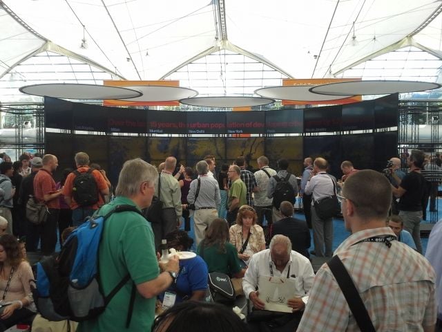
Wurman unveiled the project Monday at the Esri International User Conference, currently underway in San Diego. (About five years ago he tried to launch a similar project called 19.20.21, which sought to compare the largest cities in the world, though that effort fizzled.)
This updated project places 16 different world cities next to each other and maps out various pieces of public data. Urban Observatory’s website places maps of three cities side by side and enables users to select which of the 15 data variables to display. Users can compare housing density in Tokyo, Paris and New York, or traffic in Singapore, Rotterdam and Delhi, or how much open space there is in London versus Mumbai versus Auckland. The maps can be dragged and zoomed and, crucially, always display at the same scale, making it easy to see how each city compares to the other.
“Every city has plans to try to reduce their crime, improve their education, reduce their pollution, reduce flooding, have better utilities,” Wurman says. “Wouldn’t it be nice if they could learn from the successes and failures of other places?”
A physical exhibition, unveiled at the conference, consists of a panorama of digital screens. Ten different cities are displayed at once, each with maps at the same scale and all showing the same variable. The screens also show a flyover of a 3D model of each city, from the same altitude, offering another way to compare and contrast.
Though there aren’t any plans yet on where the exhibition part of the Urban Observatory will be displayed, Wurman says Singapore, Hamburg and the Smithsonian Museum have each expressed interest in hosting the exhibition.
Not every city has data for every variable yet, but Wurman says he’s hoping to fill things out. And 16 cities are just the start. The goal is to continually add new cities and data variables to create a truly comprehensive city comparison tool.
But right now Urban Observatory offers an interesting lens through which to view and compare cities. Using the website you can see, for example, that the downtown core of Singapore has had significantly more new development than the cores of Johannesburg and Milan. Or that the industrial lands of Chicago appear few, small and scattered, while those in Los Angeles are widely spread and numerous, and those in Abu Dhabi are highly segregated and concentrated.
Some folks could make these comparisons on their own. But for most, this may be the first time that cities and their characteristics have been put into the same context visually. Wurman argues that having access to this comparative data can be transformative for cities in terms of offering a way to measure themselves against their peers. But he also argues that such data may not necessarily be singularly useful to cities.
“I’m not predicting how much use it will be to anybody,” he says. “It might be of great use to a business person locating a Honda factory. It might be of great use to a city that wants to know where they should put their fire stations. It might be of great use to a person who’s been transferred from one city to another to figure out where would be a good place to live or what that city is like.”
Urban Observatory, while flashy and engaging, is still limited by the availability of data, and by the willingness of cities to massage their data to fit the set standard. The goal is that more will see the value and participate. But then there’s the technical issue of inevitable changes in the ways that cities collect their data. The ideal of standardization aside, some places will likely do things in ways that suit their own needs before trying to fit themselves into a predetermined set of guidelines. Wurman’s hope is that cities will see the utility of such a comparative tool and be willing to do what it takes to participate and reap the potential benefits.
But as someone who’s been trying to create such a project for more than 50 years, Wurman is quick to concede that there will be challenges.
“I’m just trying to figure out a clearer way of comparing things,” he says. “And, boy, is it hard.”

Nate Berg is a writer and journalist covering cities, architecture and urban planning. Nate’s work has been published in a wide variety of publications, including the New York Times, NPR, Wired, Metropolis, Fast Company, Dwell, Architect, the Christian Science Monitor, LA Weekly and many others. He is a former staff writer at The Atlantic Cities and was previously an assistant editor at Planetizen.


_600_350_80_s_c1.jpg)
_600_350_80_s_c1.jpg)