Are You A Vanguard? Applications Now Open
This is your first of three free stories this month. Become a free or sustaining member to read unlimited articles, webinars and ebooks.
Become A MemberAs a student of cities and a lover of urban systems, my mild germophobia often leaves me conflicted. Our shared public infrastructure — the train stations, schools and streets, the public libraries and buses — are the egalitarian centers of city life, and I love them for that. But these tragically sticky, smelly and Cheetos-cheesy commons are more than just the breeding ground of urban vitality. They are also fertile hothouses for all manner of dirt and bacteria.
For a germophobe of any standing, the world of public transportation is particularly wrought with anxiety. It is the apex of public: the welcome host to people and objects of every shape, size and degree of cleanliness. And it is a place that necessitates touch. Unlike the street, the park or the museum, our transit systems demand near-constant physical contact with their myriad surfaces. We sit. We hold on. We lean and we grab, palm after finger after sticky palm.
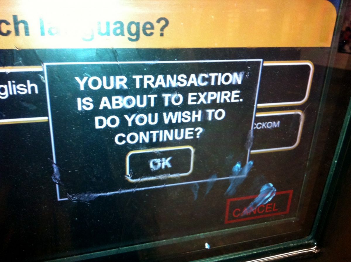
Nowhere is that fact more pronounced than the subway ticket vending machine.
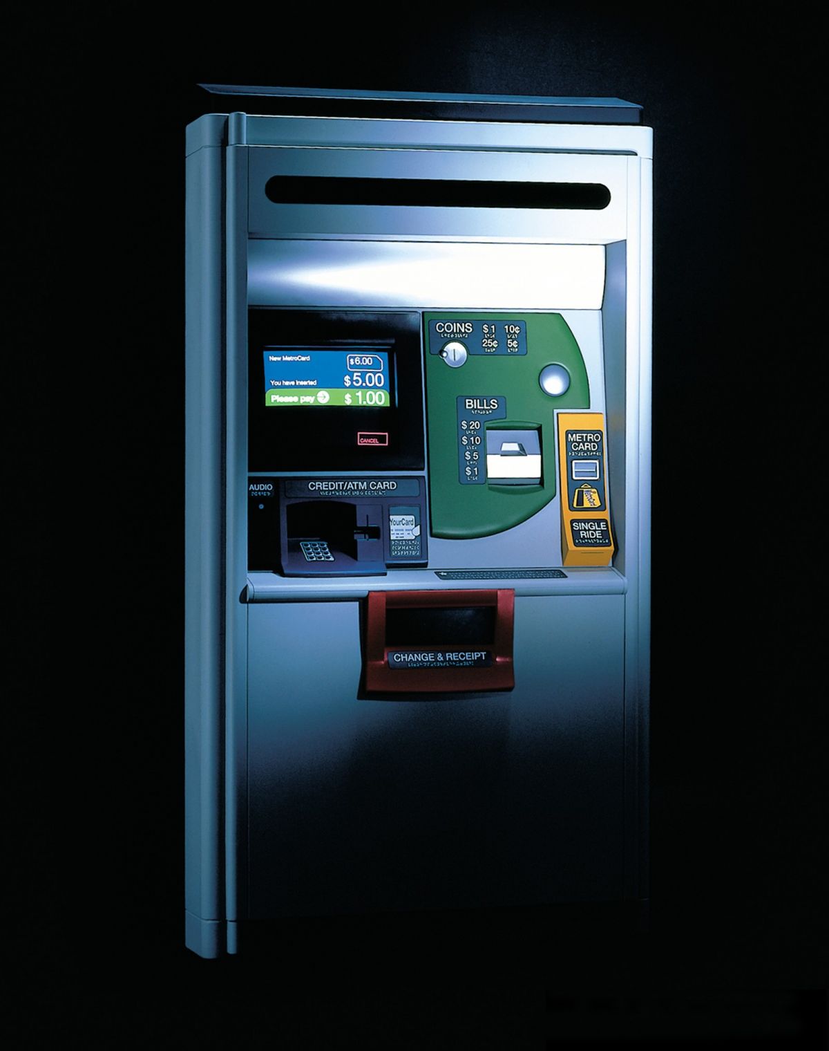
Early prototype of New York’s iconic ticket kiosk (Photo by Ryuzo Masunaga)
New York’s iconic ticket vending machines, designed by Antenna Design and featured in the Museum of Modern Art, have always delighted the design appreciator in me. The playful colors and sleek look are a welcome presence in my otherwise drab subway station at East Broadway on the Lower East Side of Manhattan.
But since moving to New York City, I’ve also found them a constant source of microbial peril. After all, what is touched by more fingers than an MTA ticket touchscreen?
A ticket kiosk at the East Broadway station
This question started to plague me as I found myself day in and day out at the mercy of the touchscreen. Every interaction, every repetitive poke, I was touching, touching, touching the hands of New York City.
Why did it have to be this way? My mysophobia led me to think seriously about the design of the Metropolitan Transportation Authority’s sleek, yet awfully touchy, machines. As a lens, germophobia felt well suited for assessing the efficiency of the design. My fears had made me ask: How little can I touch this machine to get it to do what I want? It seemed like a reasonable question.
To get perspective, I decided to try my most frequent MTA transactions — adding money to my existing card — at a kiosk belonging to the Bay Area Rapid Transit (BART) system in San Francisco.
Buying a 10-dollar card on the BART (Credit: Stephen Novotny)
Looking at the processes side by side, it was no contest: Why must I suffer so many screens on the MTA machines? I sketched out workflow diagrams for the MTA and BART for this operation and another common task, buying a new card, and it brought the difference into even sharper relief:
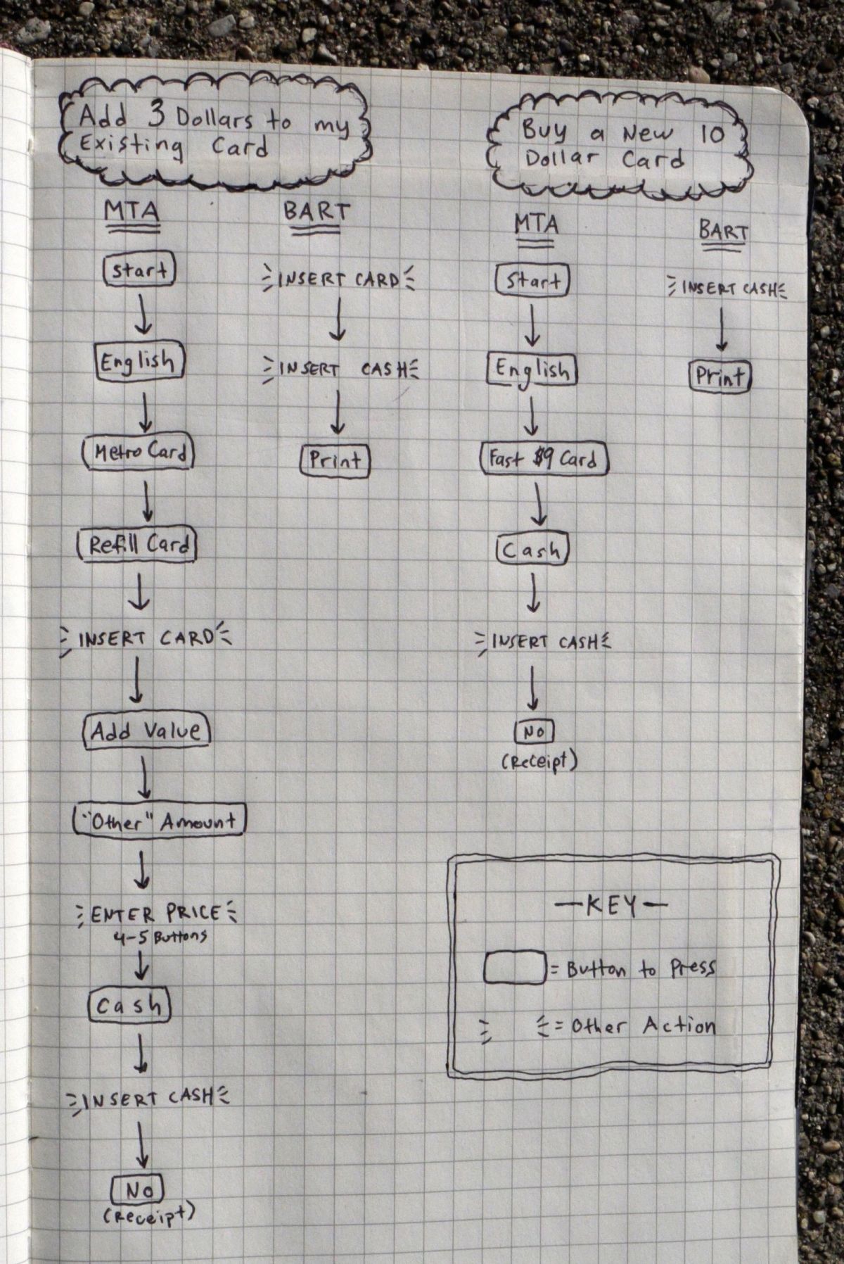
Granted, these are only two of many things you can do on these machines and not all of these processes are perfect from a minimum-microbe perspective. BART riders are particularly quick to complain about the process of adding money to a card in non-traditional amounts. That process involves pressing the plus-minus ¢5 or plus-minus $1 buttons about a billion times:
(Credit: Stephen Novotny)
Still, my comparison of the things I do most often as a commuter was alarming. This was a landslide victory for BART with its system winning points for simple, efficient design. The experience left me with big questions for the MTA:
Before I busted through the door at the MTA and started laying down design gauntlets, I had some questions for BART engineers. So I headed out to their headquarters in Oakland.
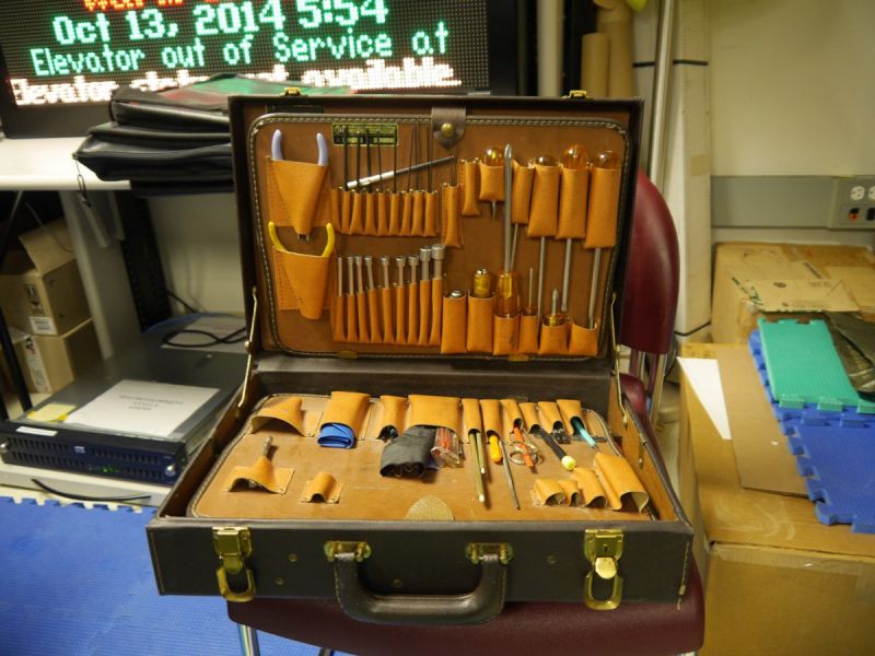
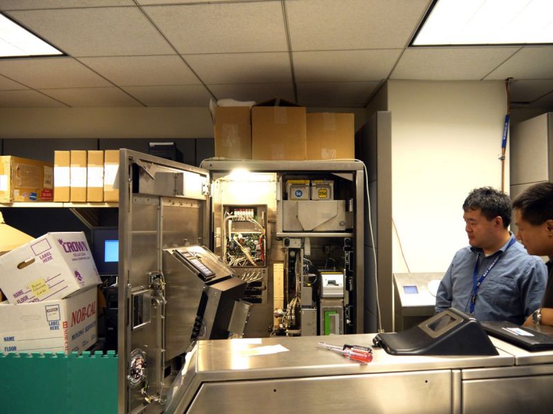
For anyone passionate about the inner workings of our cities, the BART lab is nothing less than an urban planning wonderland. Inside a glassy skyscraper across the street from Lake Merritt, all types of machines and turnstiles coexist in varying states of disassembly. People like John Yen, BART’s acting manager for fare collection engineering, who offered to show me around, spend their days perfecting the technology that keeps the rest of us moving.

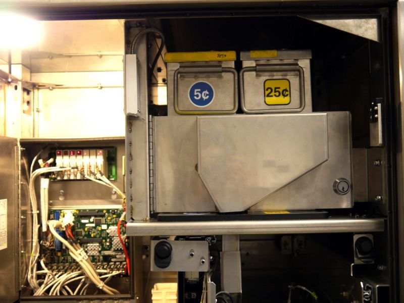
The BART Lab is divided down the middle by a series of fare gates, which are the machines that take your ticket as you enter and exit a station.
The walls are lined with BART ticket kiosks and other pieces of machinery from BART’s history, many with their faces removed or hanging agape to reveal their complex and compartmentalized inner workings.
The room has a surreal feel; it’s a land of systems management make-believe.
On the floor, interlocking rubber mats divide the space in half. On one side of the fare gates, green floor panels represent space for people who have yet to pay, while blue paneled flooring on the other side represents space for customers who have already swiped in. This helps the lab technicians keep track of their tests.
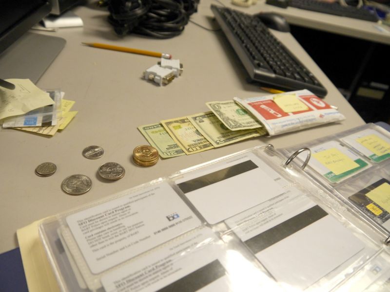
Since a day of testing BART machines can run through thousands of dollars, the BART Lab keeps a war chest stocked with cash in every available denomination and a three-ring binder filled with special test credit cards, created especially for BART by Wells Fargo.
At one of the lab’s shiny new ticket kiosks, Senior Computer Systems Engineer Weldon Chen walked me through the ticket-buying process. It doesn’t take more than one screen to discover the defining difference between the MTA purchase interface and BART’s.
BART’s start screen asks you to introduce a payment method. With this “pay-first” system, you don’t push any buttons to begin. You just slide in a card or enter your money and then the machine will prompt you with appropriate questions based on what you feed the machine.
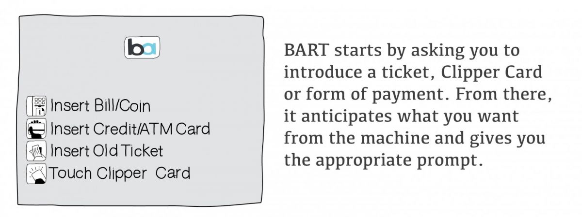
With that simple choice on the part of the BART designers, the bulk of the MTA kiosk prompts are rendered unnecessary. To find out a bit more about why BART developed their system using the “pay first” model, I called up Brin Owen, who worked as a consultant to BART when they were developing the ticket machines in the late ‘90s.
Owen recalled the days of BART’s previous generation of kiosks, which were decidedly straight-forward.
“You put in your bills and coins, and you pushed a big, large button that said ‘issue ticket.’ And that was it. It was a very, very quick transaction,” he recalled.
When BART decided to add a more involved interface, engineers wanted to be sure not to slow down the process. Speed, after all, is essential when people are rushing to catch trains.
Ultimately, the pay-first model offered the fastest transaction, and so they went with that. The inspiration for the design? An ATM.
“That was a kind of self-service kiosk that most everybody, at least banked customers, could understand,” Owens told me.
Back in New York, I looked up industrial designer Masamichi Udagawa. He is half of Antenna Design, the studio that created the MTA ticket machine interface that’s still in use today. He sat down with me at Antenna’s New York office in Chelsea and told me a bit about how he and Antenna’s other co-founder, Sigi Moeslinger, designed the MTA interface.
At first, I had what felt like pre-fight jitters. I had a serious design gripe and some hard-hitting questions that I wanted to level at this man, who happened to be the co-founder of a highly respected and accomplished design studio.
The conversation did not unfold as I planned.
The first thing Udagawa did was to provide some context for the realities of New York City in the late 1990s, when the MTA ticket vending system was being developed. What I hadn’t realized before was exactly how novel these machines were at the time.
“This was the first time a touchscreen was really [going to be] introduced to the public [in New York City],” remembered Udagawa. “When [the MTA ticket] machine came out in 1999, 50 percent of subway riders didn’t have bank accounts, so they had no experience with ATMs, let alone touchscreens.”
It’s interesting to note here how in the late 1990s the ATM could be used as both an inspiration and as a cautionary tale. Remember, the iPhone was a good seven years off and touchscreens were far less common than they are today. That guided Antenna’s design in a major way. “It was a different world in ’99, even if it was only 15 years ago,” Udagawa said.
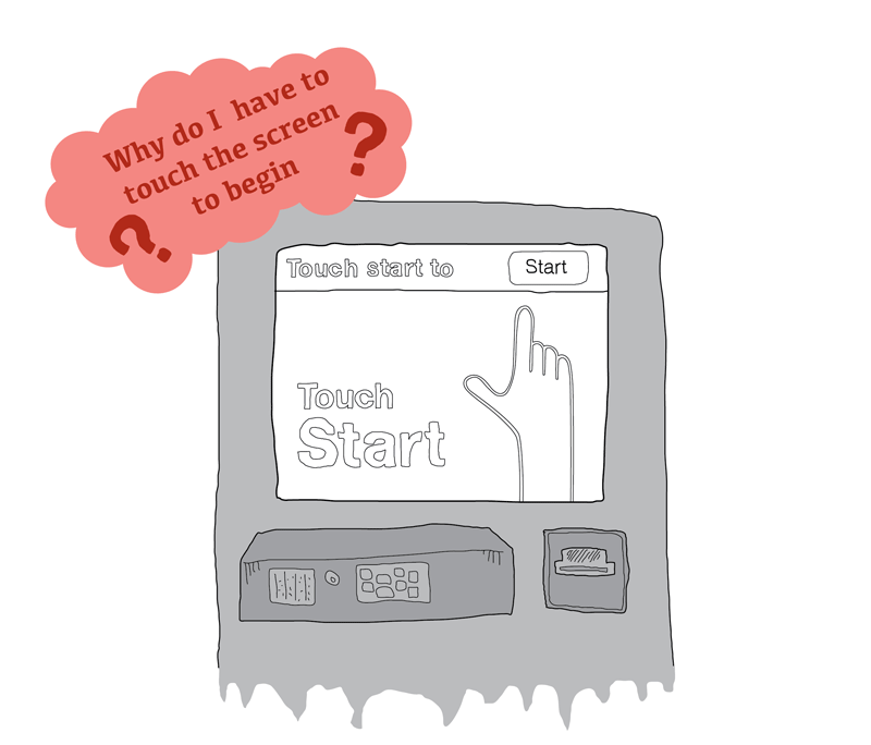
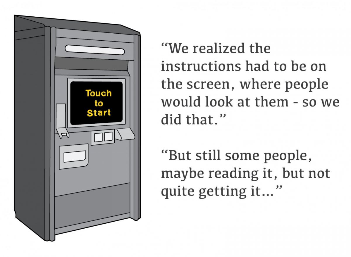
The issue is perhaps best illustrated by Udagawa’s explanation of the “Press to Start Screen,” one of the features of the MTA design that most niggled at me.
A huge number of people who tested early mock-ups of the machine were at a complete loss when met with the new touchscreens, he said.


At this point, I was beginning to see the problems with my hyper-efficient ideas of trimming excess screens. I was quickly grasping that the system I battled with daily was created for a different time.
In the late ‘90s, when Udagawa and his team were hired by the MTA to make the machines more user-friendly, riders had a very different relationship with technology and in particular, with technology in the public realm.
When Antenna Design came in, commuters were having a hard time adjusting to a pay-first interface, a system much like BART’s current ticket machines. “I saw immediately that wasn’t going to work,” said Udagawa, “the interface was a big problem.”
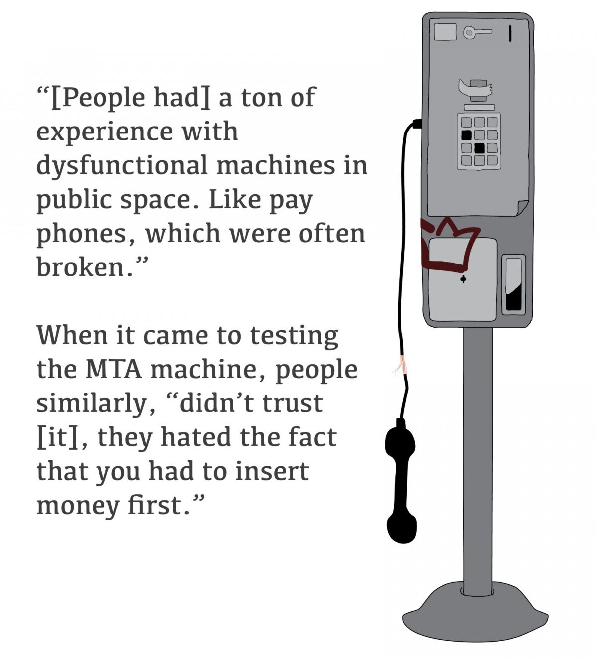
New Yorkers simply didn’t trust the machines.
Here he was touching on another facet of the MTA design that drove me crazy. BART’s pay-first model meant that I sped through the process of purchasing tickets or adding fare while hardly even interacting with the machine. I loved that feature of BART, but back in the ‘90s, Udagawa identified it as the biggest problem with the MTA’s design.
After extensive testing confirmed Udagawa’s diagnosis, the MTA agreed that a new model was needed. The designers worked with the agency to find what they called a “conceptual model” for the machine, a guiding format, whose familiarity would help people intuit how to interact with it.
“Since it’s a new thing for people, how should this machine behave? The machine needed to have some familiarity with what people in New York City already knew. So we looked for examples,” explained Udagawa. “As I said, we couldn’t rely on ATMs, because 50 percent [of the population] didn’t have experience.”
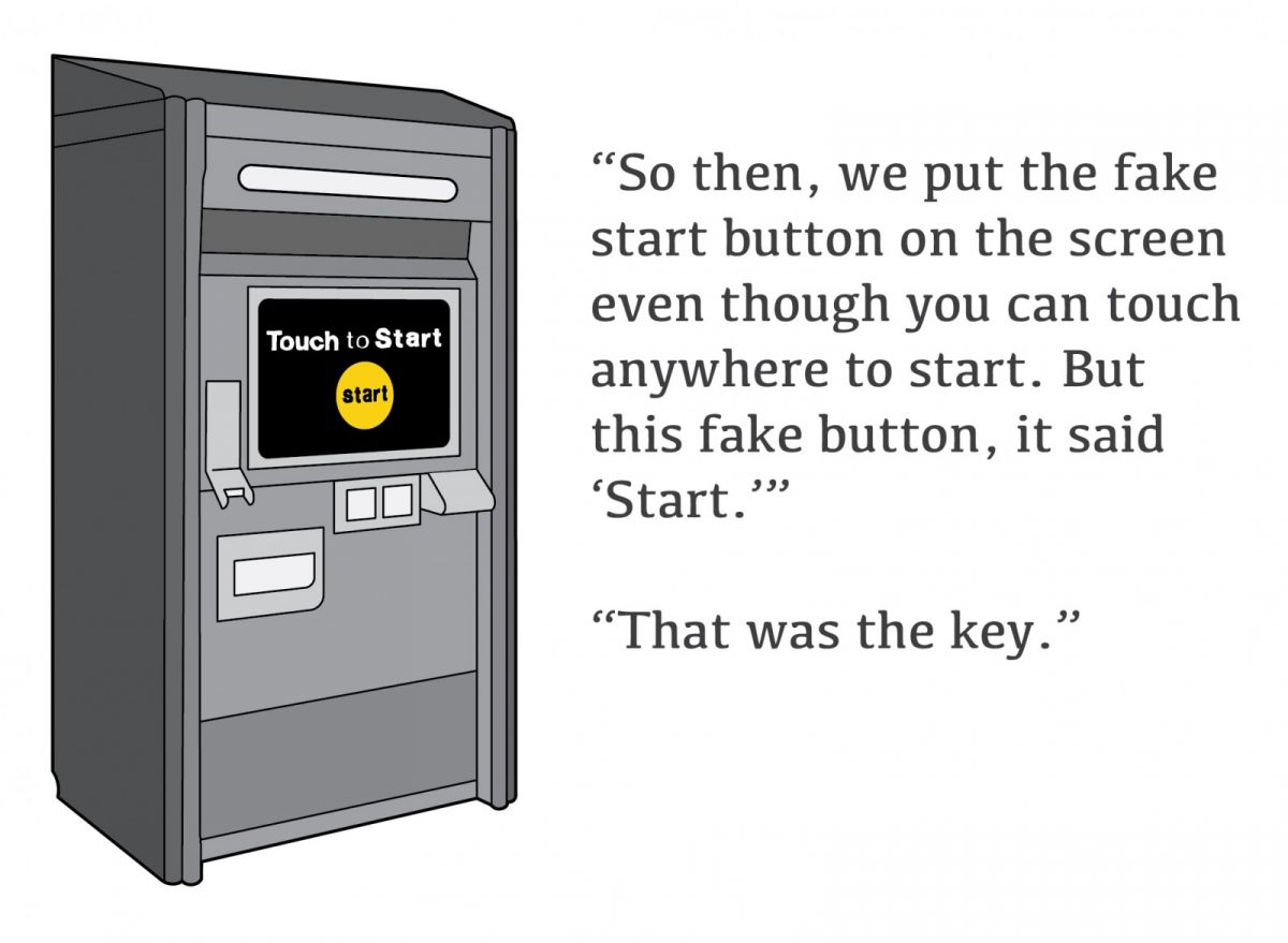
“So, we looked at soda machines, which most people knew how to use. And then we looked at a second model, simply a store.”
“It’s interesting, if you think in terms of transaction sequence, the soda machine and store have an opposite sequence. The soda machine is like [the MTA’s] first prototype, you start the transition by inserting money, then you make a selection and hopefully the selection comes out, which may not happen,” Udagawa said with a laugh. [At] a store, no one pays upfront. So you go in, you check out the products, check out the prices, you gain confidence and then you decide to pay.”
“We tested [the two prototypes] with 20 or so people, and the result was overwhelming,” Udagawa said, “Everyone just hated the soda machine model.”
Once the results of these tests came back, the MTA was ready to support Antenna’s reimagining of the ticket purchasing system. Antenna set out to create an interface that mirrored the experience you might have buying an item in a corner store. Once you know what to look for, the resulting design is almost poetic in its ‘90s approach to imitating a bodega with a little R2D2 ticket kiosk. As I scroll through the MTA interface now, the corner store-ness shines through. The simple, singular questions mirror what you might be asked by a store clerk: How would you like to pay? Do you want an unlimited card or a single ride? Even the “touch to start” screen could be thought of as the friendly — though perfunctory and superfluous— “Hey, Buddy. How’s it going?”
Though the multiple screens were tiresome for me, I was beginning to understand that I wasn’t the only kind of user the MTA designed for. No matter how infuriating they might be to veteran NYC commuters, the single-question-per-screen approach was designed to be foolproof for new users and tourists, unaccustomed to the city and its subway system.
The interaction design reflected a “leave no rider behind” ethic and that was hard to argue with.
“In New York City we have a constant flow of new people,” reflected Udagawa. “Even though the machine itself is 15 years old, there’s always a first time for people new in the city. So it is good to keep that super obvious instruction there.”
Turning back at the BART system with the lens of inclusion introduced by Udagawa, I saw more clearly its weaknesses. To begin with, you can’t even change the language on the BART machine. Yes, there’s no extra screen to clutter the interface, but that’s an annoyance for non-English readers who are left with the choice of gesticulating until someone offers their help, or finding a BART employee in the station who can offer them a card on which they can point to their language. Once the BART employee knows their language, he or she can provide a phone number to call and then, once the right telephone prompt is reached, the would-be commuter can be talked through the system in their chosen language. If there are no working and available phones, good luck.
Beyond that, BART’s varied fare structure makes finding the right fare amount pretty hard to find at first. You have to look up your fare on a destination table and then take that information to a ticket machine. In fact, for all of its ease of use for the initiated, it seems to have caused enough frustration for newcomers to inspire at least half a dozen complete interface redesigns from the public.
Pradip Mistry leads research and development at Cubic Transportation Systems, one of the major players in public transportation machinery. His company makes the ticket vending machines for both BART and the MTA. Mistry believes that in time, we will all rely on the machines less.
“Over time the need for people to go to kiosks will be diminished,” he told me. “Eventually you will have a contactless card and you’ll be able to add money via an account in the cloud.”
With that in mind, the value of Udagawa’s “leave no rider behind” ethos becomes even clearer. In the future, a city’s local residents will turn to customized, super-quick interfaces on their personal devices and interact less with public ticket machines. Newcomers and tourists, on the other hand, will continue to rely on these public machines for much longer. As such, the MTA’s foolproof approach to interaction design may become increasingly central. That’s a good thing, no matter how much skin contact it (unfortunately) necessitates.
And maybe that’s OK. Democracy, after all, has never been sterile.
Our features are made possible with generous support from The Ford Foundation.

Aaron Reiss is a journalist and mapmaker based in Chinatown, NYC. His work has been featured in novels, academic papers and publications like The New Yorker and The New York Times. Find his work at www.aaronreiss.com and on twitter @erinreiss.
Next City is a nonprofit news organization that believes journalists have the power to amplify solutions and spread workable ideas from one city to the next city. Our mission is to inspire greater economic, environmental, and social justice in cities.
Learn more about us →

20th Anniversary Solutions of the Year magazine