It’s a reality that some, even children, seem to recognize — that where you grow up is a significant factor in determining your future economic prospects. In some areas, growing up even a few blocks from where you live can make a huge difference.
Harvard University economist Raj Chetty made a splash a few years ago with his analysis of anonymized federal income tax records for 40 million individuals, revealing in unprecedented terms the unequal geography of intergenerational mobility. More than four years later, Chetty, along with a team of researchers from Harvard, Brown and the U.S. Census Bureau’s Sonya Porter and Maggie Jones, teamed up to create The Opportunity Atlas, illustrating that unequal geography down to the census-tract level. The atlas and its data were made available to the public on Monday.
The project combines anonymous data from the Internal Revenue Service and the U.S. Census Bureau, and follows 20 million Americans from childhood to their mid-30s. Among other data points, the maps show how children who grew up in each census tract ultimately ended up — in other words, even if they moved somewhere else as adults, their current household characteristics show up back in the census tract where they spent their childhood.
“Nationwide, the variation is striking,” the New York Times reported. “Children raised in poor families in some neighborhoods of Memphis went on to make just $16,000 a year in their adult households; children from families of similar means living in parts of the Minneapolis suburbs ended up making four times as much.”
But it’s the local disparities in intergenerational mobility that policymakers will find most compelling, the Times’ Emily Badger and Quoctrung Bui reported. The duo zoomed in on a pair of neighboring census tracts in Seattle to illustrate. On one side, with households earning only $5,000 less per year than the other, children were more likely to be incarcerated and less likely to be unemployed as adults. In response, the Seattle Housing Authority is offering some families with housing vouchers extra rent money and help to find a home in the better-performing census tract, the Times reported.
Chetty found, according to NPR’s Morning Edition, that if a person moves out of a neighborhood with worse prospects into to a neighborhood with better outlooks, that move increases lifetime earnings for low-income children by an average of $200,000. But moving a lot of people is impractical, so researchers instead are trying to help low-performing areas improve, according to Morning Edition.
The maps also offer another chance to review how those neighborhood-to-neighborhood disparities came to be. As others have noted — including author Richard Rothstein in his book, “The Color of Law” — throughout the 20th century, government policies and actions at the federal, state and local levels all contributed to the systematic investment in exclusively white suburbs, while denying similar levels of investment to black and Latino neighborhoods and households. The resulting disparities of investment available based on race filtered through history into differing outcomes with regard to household income and wealth, as well as disparate access to well-funded schools, parks and other amenities.
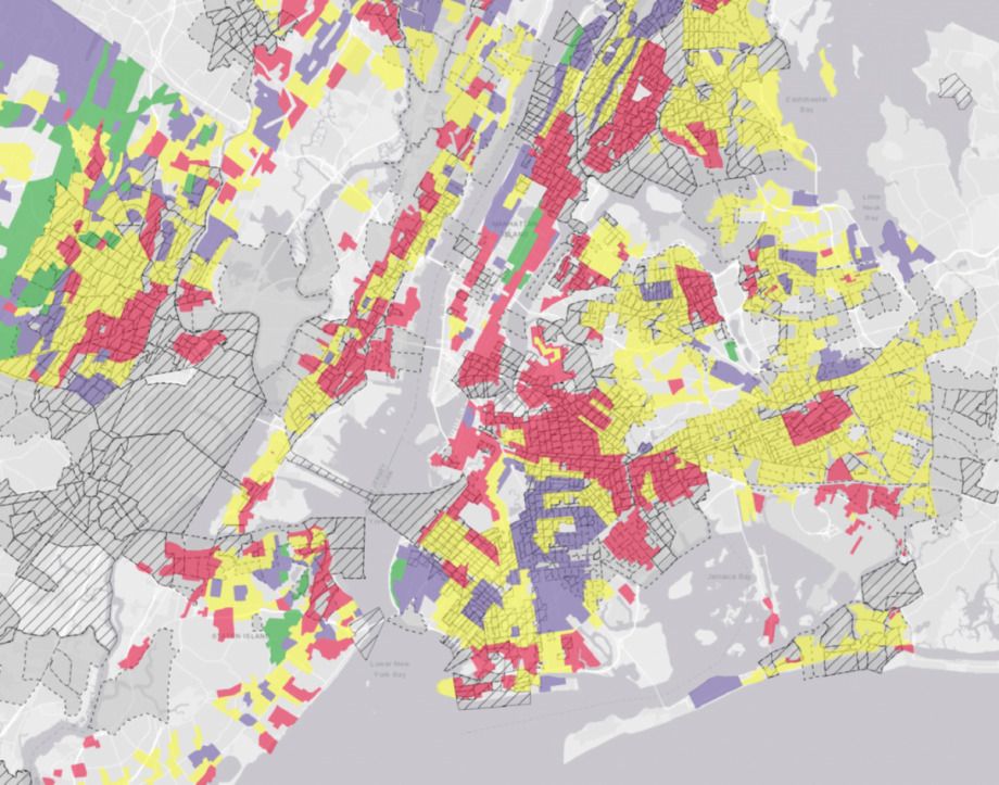
The patterns of disinvestment, while not perfectly aligned, are striking in similarity to the Opportunity Atlas’ neighborhood-level findings. This historical map of NYC, from the National Community Reinvestment Coalition, shows the green and purple areas where federal agencies would provide mortgage insurance to incentivize lending to homeowners and developers, versus the red and yellow areas where such incentives were denied to developers. Federal records show the color-coding was largely based on race, giving rise to the term ‘redlining’ as a shorthand for discriminating against lending applicants of color.
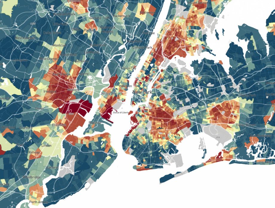
And here is a current map of NYC from the Opportunity Atlas, showing the adult household incomes of children who grew up in low-income households based on where they grew up. Darker red represents lower income as adults; darker green represents higher income as adults.
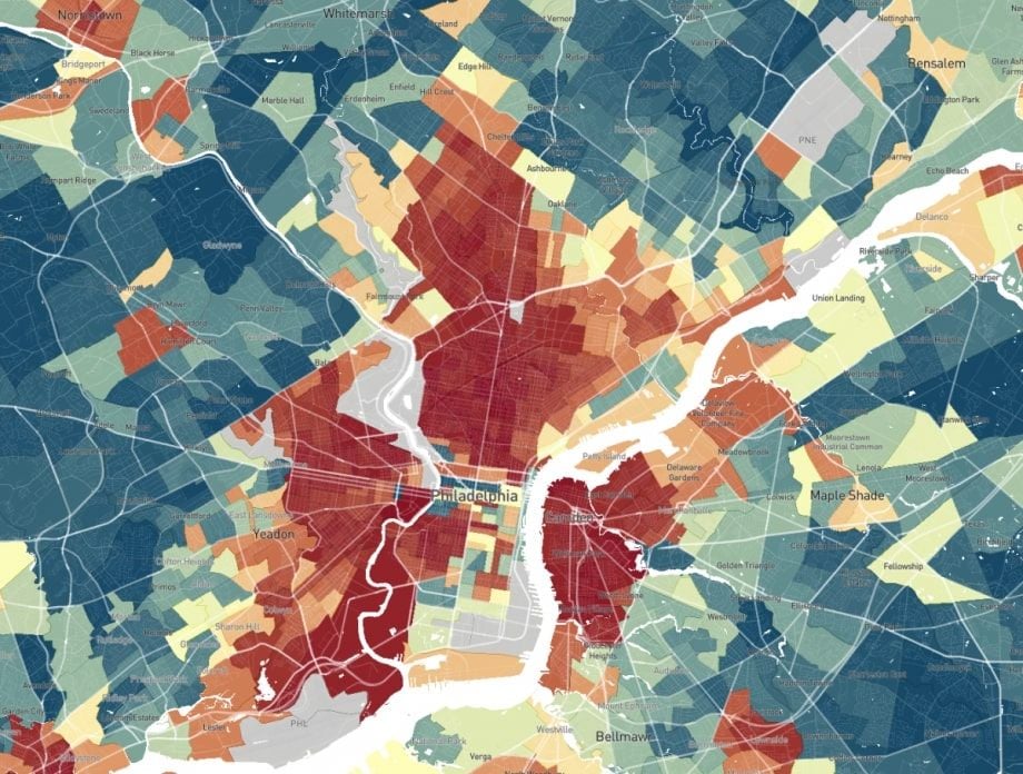
Here’s Philadelphia’s historic redlining map.
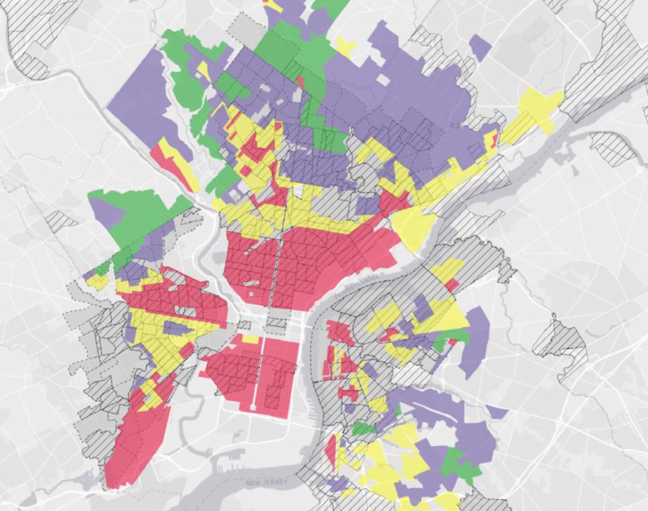
And Philadelphia’s current Opportunity Atlas map.
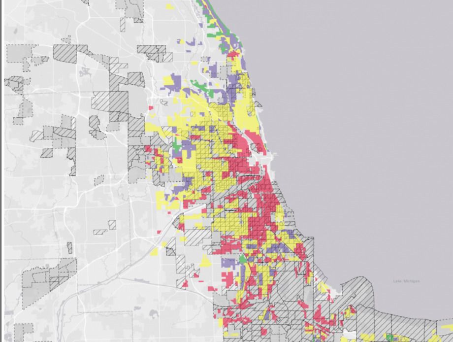
Chicago’s historic redlining map.
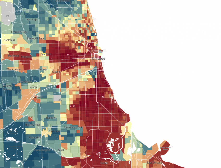
Chicago’s current Opportunity Atlas map.
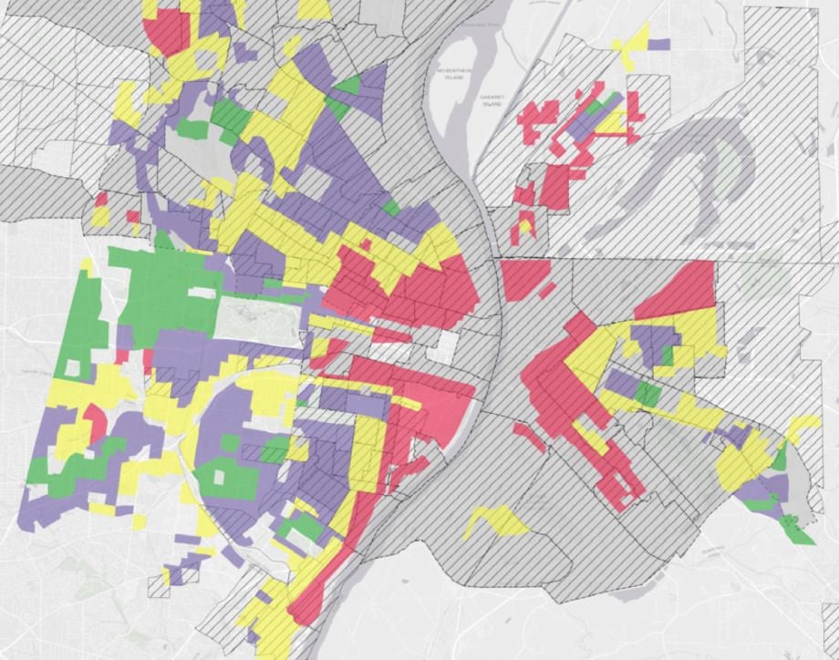
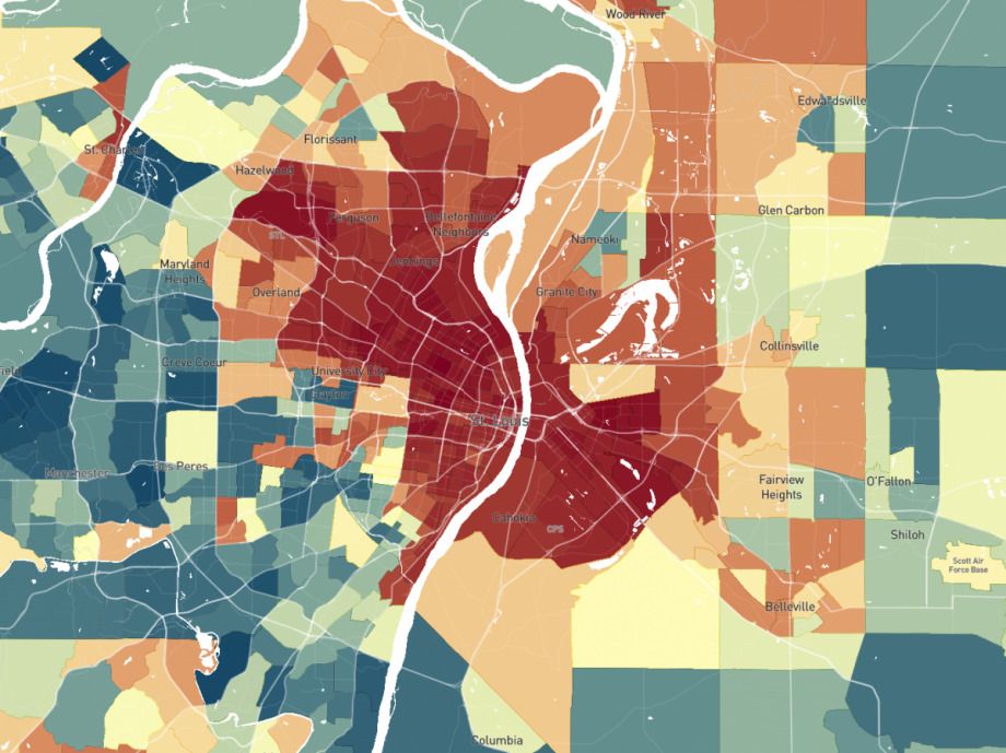
St. Louis’ historic redlining map.
St. Louis’ current Opportunity Atlas map.
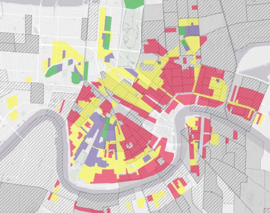
New Orleans’ historic redlining map.
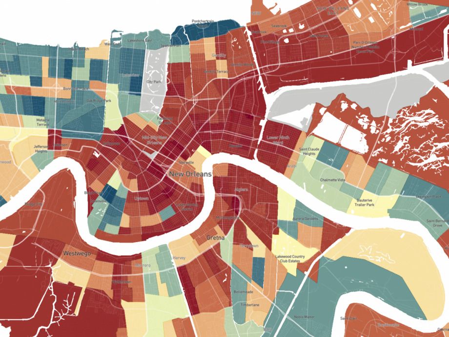
New Orleans’ current Opportunity Atlas map.
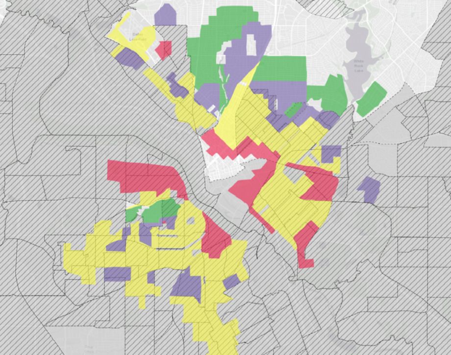
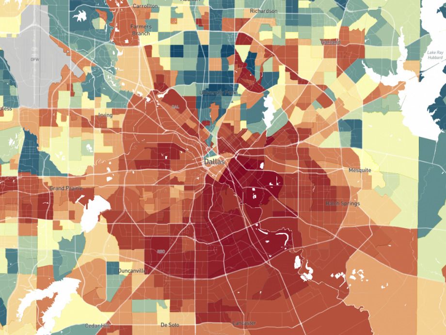
Dallas’ historic redlining map.
Dallas’ current Opportunity Atlas map.
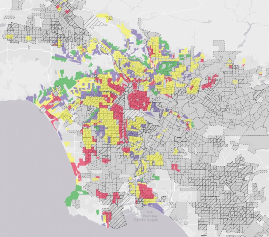
Los Angeles’ historic redlining map.
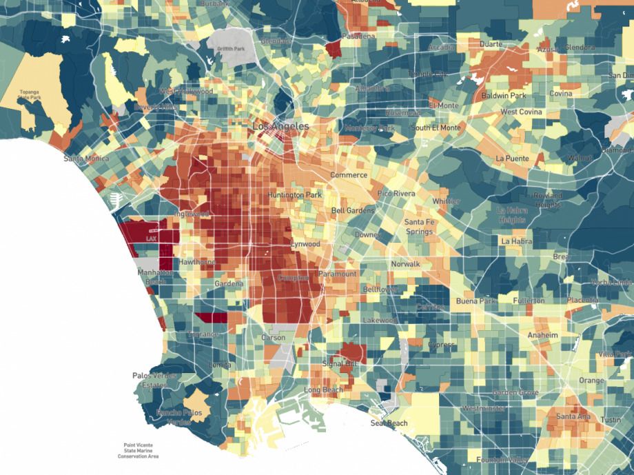
Los Angeles’ current Opportunity Atlas map.

Oscar is Next City's senior economic justice correspondent. He previously served as Next City’s editor from 2018-2019, and was a Next City Equitable Cities Fellow from 2015-2016. Since 2011, Oscar has covered community development finance, community banking, impact investing, economic development, housing and more for media outlets such as Shelterforce, B Magazine, Impact Alpha and Fast Company.
Follow Oscar .(JavaScript must be enabled to view this email address)