In October, the Massachusetts Bay Transit Authority announced the winner of a competition to redesign Boston’s subway map. The winning design, created by Mikheil Kvrivishvili from Moscow, will start appearing in train stations in early 2014.
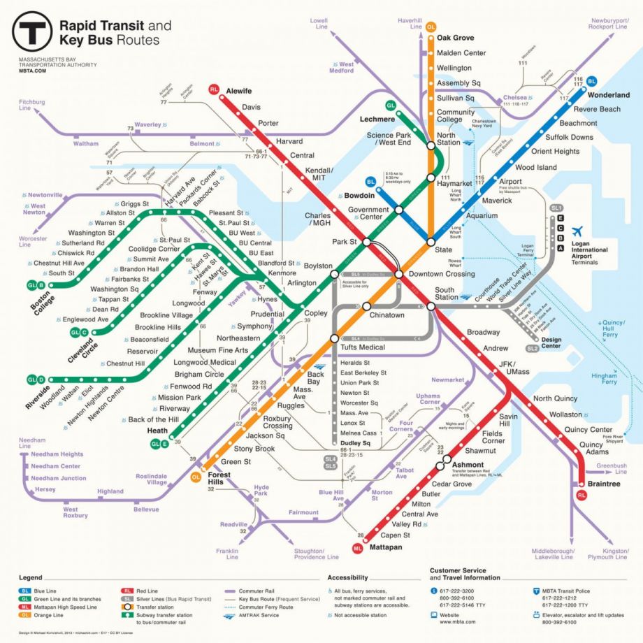
The new map, shown above, is certainly much clearer the old one, below.
_740_733_80.jpg)
But what makes one map better than another? Vision researcher Ruth Rosenholtz, of MIT’s Department of Brain and Cognitive Sciences, has built a computer program to pinpoint design features that work or don’t work. The program uses information about peripheral vision to replicate what people see when they look at an image. Rosenholtz simply uploads an image into the program and tells it where the hypothetical viewer’s gaze is focused.
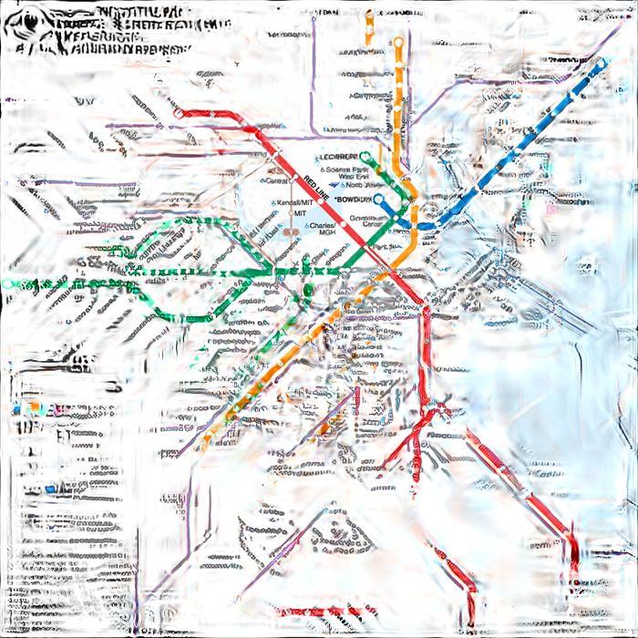
“Essentially it runs for a while and then spits out one of these visualizations, called a mongrel,” she says. The mongrel shows what information is available at a single glance — important stuff if you’re rushing to catch a train.
Below are the mongrels for the old and new MBTA maps. In these versions, the viewer’s gaze is focused on the Kendall station.
Mongrel for the old map.

Mongrel for the new map.
A few things become apparent when looking at the mongrels. On the old map, the angled station names become smeared, and parts of the red line disappear entirely. In the new map, the horizontal text and lines that bend at 90- and 45-degree angles are easier for the eyes to make sense of, thus making it easier for the viewer to understand how the Kendall stop fits into the rest of the subway system.
Why does peripheral vision matter when reading a map? “If you cut a hole in a piece of paper, look at a map, and try planning a route from point A to point B, it can be really painful,” Rosenholtz says. Your peripheral vision provides the context that your brain needs to plan your next glance, and to knit multiple glances together into a comprehensive image. When the periphery is muddled, it slows the reader down.
“There’s a real limit to how much we can remember from one glance to piece it together with another glance,” Rosenholtz says. “For a really bad map, the user goes up and traces it with a finger.”
By analyzing the top six finalists in the MBTA competition, the lab noticed a few other mistakes that designers commonly make. One is to draw subway stops as holes in a given line. “Our models suggest that’s actually a very bad idea for peripheral vision,” Rosenholtz says. “If you break it up, the paths become uncertain because there are these holes in them.”
Another problem was overdesigning the logo. In many of the submissions, the big, bold “T” symbol representing the MTBA was the most noticeable object. Oftentimes it was so large that viewers could still read it even if they focused on the opposite side of the map. That’s unnecessary and potentially distracting, according to Rosenholtz. “If you’re looking at the map, then you already know you’re looking at a T map,” she says. “[The logo] is probably the least important information.”
Rosenholtz’s lab has previously used the program to analyze maps for the London Underground and the New York City subway. The results show that a controversial abstract map of New York’s subway system, introduced in 1972 but rejected because it wasn’t geographically accurate, is actually much more readable than the tangled, geographically accurate map that replaced it in 1979. Designers already knew that, of course, but the mongrels offer an objective and standardized tool to analyze complex designs.
The lab is now testing and refining the computer program. Researchers ask human volunteers to fixate on a specific point on a map, and then describe what they see in the periphery — to trace out the paths of roads and locate bodies of water, intersections and icons. The lab will see how well that feedback matches up with the computer-generated mongrel.
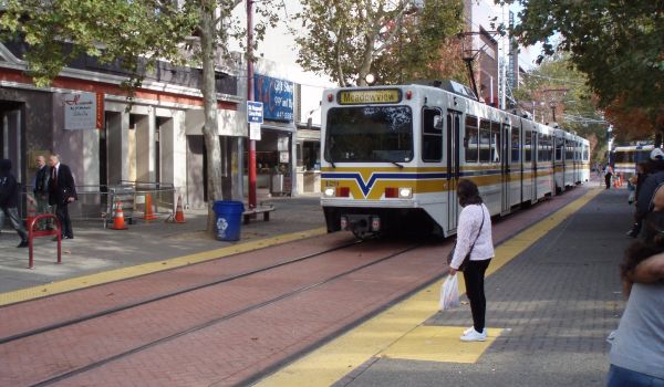
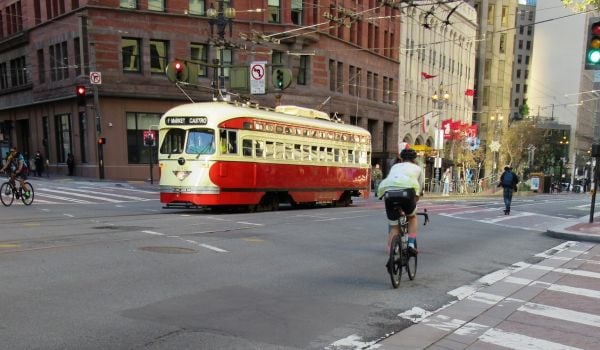
It is also using the program to test the readability of road maps for cities like Boston and San Francisco. The aim is to compare maps from Google, Bing and other mapmakers to determine which style elements display complex street information with visual clarity. The results could help designers develop better road maps and GPS systems.