At Next American City, we pride ourselves on continuing the tradition of long-form, thoroughly reported journalism to identify and share urban best practices. But that doesn’t mean we’re above being completely mesmerized by nifty infographics — especially when they convey important information about cities in a non-boring manner.
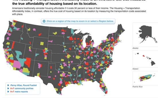
Three crossed my desk today. The first was created by the Center for Neighborhood Technology, which received a 2009 MacArthur Award for Creative & Effective Institutions. Among other things, the think tank develops creative visualizations of urban metrics, and in March, they released the Housing and Transportation Affordability Index, meant to show the true cost of living in urban areas across the U.S. based on both housing costs and transportation costs (most affordability measures only take housing into account). Next, they divided these costs by “representative regional incomes” to come up with a cost burden placed on a typical household in a given area. “Affordable,” according to CNT’s map, means that the combined costs of housing and transportation consume less than 45 percent of income. You can take a look at the whole, multicolored nation to quickly see that outer-ring suburbs carry the highest cost burden, or you can zoom all the way down to see how your block shapes up. My block, in Center City Philadelphia, comes in at 36 percent, which seems about right to me. But if I were to move just a handful of miles into the suburbs — to, say, Bryn Mawr — this cost could skyrocket to 60 or 70 percent.
If you don’t feel like reading through the entire, 172-page “State of Metropolitan America” report recently released by the Brookings Institution’s Metropolitan Policy Program — though I will say that I took the time to do so and it was well worth it — you can get a close look at all the metrics in a comprehensive interactive graphic online here. It’s a demographic goldmine: You can choose what category you’d like to see, including population, race and ethnicity, immigration, education levels and economic indicators, among others, and then you can look at all of this data according to metro area, the city itself, the suburbs alone or state-by-state. A few tidbits I picked up: The Greater Provo area has the nation’s second-highest number of children under five, but ranks 95th among metro areas in population of working age. The Youngstown-Warren-Boardman area of Ohio and Pennsylvania has the highest percentage of people who drive to get to work. Honolulu has the 8th-highest median national income. Enjoy.
And, on a more morbid note, the New York City Department of Health has just released, for lack of a better term, a cancer map, detailing which neighborhoods have the highest cancer rates, and then neatly laying out nearby industrial facilities, such as bulk chemical storage sites and brownfields, that may — or may not, the Department is careful tonight — have something to do with it. The map doesn’t take a bunch of things into consideration, such as age, other cancer risk factors or the idea that chemicals can easily travel beyond the location of a facility itself, but it’s still a fascinating account — though in a city as population-saturated as New York, it probably won’t influence people as much as