Upon request, the Environmental Justice League of Rhode Island will give you a guided tour. They’ll show you the Port of Providence. They’ll take some time in front of Alvarez High School, which sits on a still-contaminated brownfield. Their “toxic tours” show participants the hazardous sites in the city. Jesus Holguin, EJLRI’s youth leadership director, learned about these sites while a student advocate at the League.
“I have asthma, my whole family has asthma, and I never thought there was a link,” Holguin remembers. As he leads students now, he sees them making the same connections. Hearing about a site, he explains, will prompt a student to respond, “Oh, I live on Allens Ave.”
Recently, the EJLRI decided to tell that story a different way, and used maps to explore the impacts of environmental racism in Providence. The visuals — some were created in-house, some are sourced from other organizations, including the EPA — were part of a position paper condemning a proposed National Grid natural gas liquefaction plant.
Scholarship continues to reveal lasting after-effects of industrial siting and zoning, and how, for so many decades, facility placement was often clustered within minority communities, which heightened toxic exposure in these neighborhoods. A new report from the Center for Effective Government analyzes residences within one mile of each facility on the EPA’s Risk Management Program list. (There are 12,545 such locations.) The report reveals that people of color are nearly twice as likely to live in these zones, while two-thirds of the 5.7 million children living in these areas are of color.
Class distinctions certainly show poorer outcomes, still race itself reveals stark results. “Racism keeps lower- to middle-income people of color stuck in danger zones,” award-winning environmental scholar Robert Bullard told the Root last year. “African-Americans making $50,000 to $60,000 per year are way more likely to live in a polluted environment than poor white families making just $10,000 per year.”
Board member Julian Rodriguez-Drix explains that the EJLRI used maps to capture how environmental racism is felt on the ground. (Disclosure: Rodriguez-Drix was a college classmate of mine.) Approaching merely one layer, “where you’re looking at conversations on economic inequality, or conversations around health, or conversations around the environment — it’s all of those, but those conversations by themselves usually don’t quite tell the whole story,” he says.
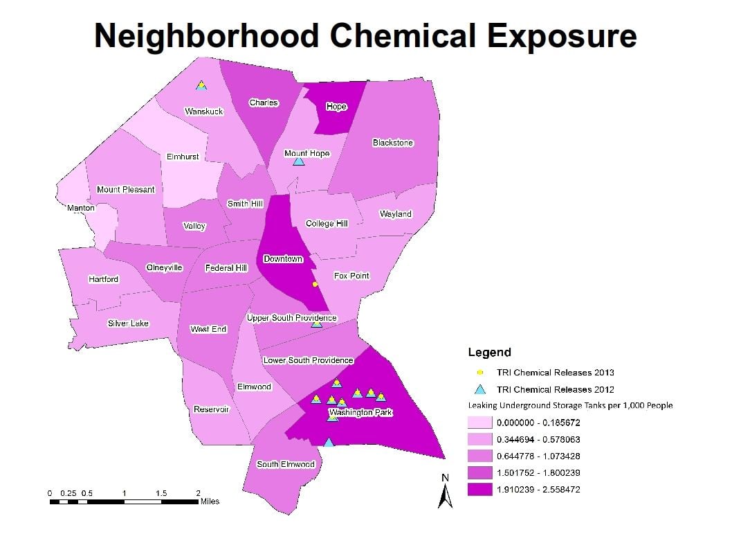
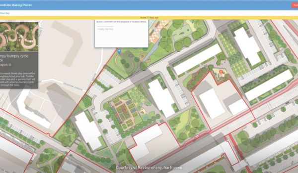
(Credit: Environmental Justice League of Rhode Island, using ArcGIS)
The Rhode Island researchers sifted through National Grid documents for explanations on why certain projects had been placed where. Zoning was a common one, Rodriguez-Drix says. “When you look at the maps you can really see those, to be honest, apartheid lines. A very short distance south of [waters within industrial zoning], you see a very affluent white community with a different kind of waterfront.”
Advocates at EJLRI see the mapping as an educational tool that they hope people throughout the city will use. Holguin also would like the visuals to be a conversation starter. When it comes to “environmental racism,” he says, “no one listens unless you have statistics … . We can show stuff like maps and statistics, but people’s stories are what we want to hear. We want to echo their stories so that their voices are heard.”
The Works is made possible with the support of the Surdna Foundation.

Cassie Owens is a regular contributor to Next City. Her writing has also appeared at CNN.com, Philadelphia City Paper and other publications.
Follow Cassie .(JavaScript must be enabled to view this email address)