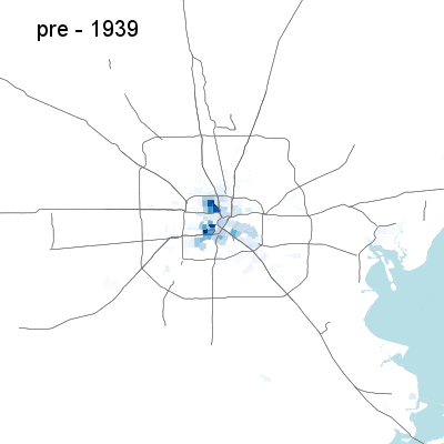
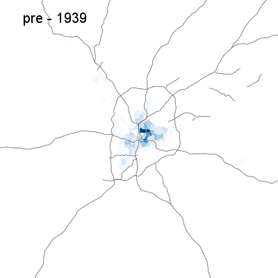
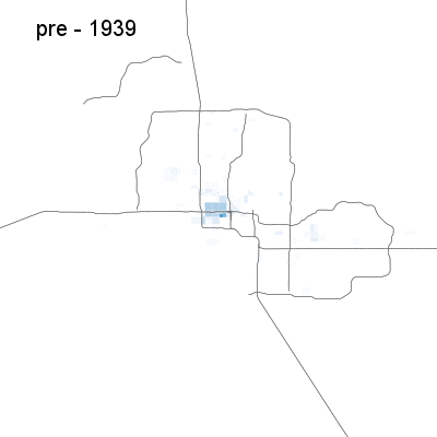
Last week, I featured a data visualization by Ian Rees, showing how Houston has sprawled (and recently turned somewhat inward) over the past few decades. Now, Rees has done a whole set of GIFs for Next City, featuring cities across the U.S. The charts show the density of housing developed in each year in each Census tract, so dark colors (the Houston animation to the side has the scale) show dense development over a given area (dense infill or sprawl), while paler ones show sparser growth (sprawl or smaller amounts of infill). The animations are a work in progress (Census tracts on the coast reach out into the water, for example, exaggerating the amount of growth along the Hudson in the New York case), but they give a good snapshot of growth in various metropolitan areas across the country. Because of data limitations, all growth in the 1930s and earlier is lumped together, so growth after that period is what really shows. (To replay a GIF, click to open in new window.)
Atlanta
Atlanta is America’s sprawliest city, and it shows. The sprawl is very sparse, lightly populating an area and then moving on, without any of the periods of dense sprawl that give cities like L.A. and Houston a certain level of auto-oriented density that is easier to serve with transit and make more walkable.
Atlanta does, however, follow the pattern of most big U.S. cities of finally turning inward in the first decade of the millennium, with growth in Downtown and Midtown. The sprawl, however, continues in all directions, concentrated especially to the north and northeast.
Bay Area
Despite the Bay Area’s status as America’s most dynamic urban area, growth essentially peters out by the present day.
San Francisco of course had most of their growth in the prewar period, but the ’40s saw significant growth still in the Sunset District, after which growth returns to the core in the ’50s and ’60s as high-rises went up in the neighborhoods north of Market Street. Growth shifts to the South of Market area in the ’90s and intensifies there in the 2000s.
What’s scary, though, is that over the last decade of the animation, the Bay Area’s growth is nearly restricted to SoMa. The rest of San Francisco sees practically nothing, and aside from pockets of growth in downtown Oakland and near the heart of San Jose, growth pretty much stops everywhere else. The most in-demand part of Silicon Valley, north of San Jose along the Caltrain corridor, sees next to no new residential construction, nor do any of the areas of the East Bay that were built up during the postwar era. There’s still sprawl in the far reaches of Contra Costa and Alameda counties, but even growth there is light, closing off all avenues for more affordable new construction.
Chicago
Chicago’s animation shows a city that has sprawled wide in the postwar period, but which has seen a strong return to growth in the core — despite the restrictions on growth of the past few decades.
Traditionally, Chicago’s North Side, along the lake, has been its strongest. During the ’60s and ’70s, while the city was going down the tubes and developers were fleeing, the lakefront remained a hive of construction activity. But starting in the ’80s and continuing through the present side, the hottest slice of the city — from Streetville and the Gold Coast up through Lincoln Park all the way to Edgewater — evaporated almost completely.
The Loop gets dense residential construction in the ’60s that continues through to today, with the close-in neighborhoods to the north (except for the waterfront), west and south of the Loop finally getting dense infill again starting in the ’90s and continuing through the 2000s. Still, the lack of development on the North Side lakefront means that Chicago’s housing stock growth in the first decade of the 2000s was an anemic 3.6 percent. It also means that much of the new growth — skewed towards the high-end, given the economics of new construction — occurred in poorer neighborhoods, speeding gentrification.
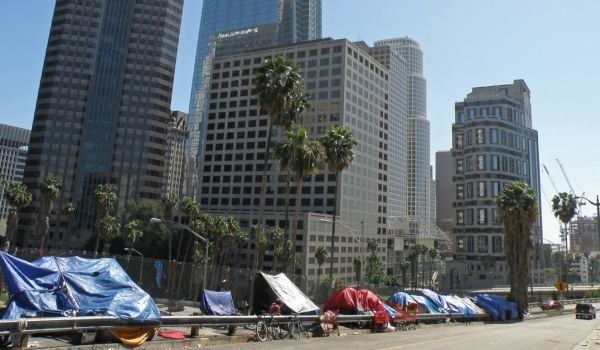
Los Angeles
Los Angeles is another scary one, with the formerly fast-growth region coming to a halt over the past decade. The city starts with a substantial base of housing downtown and close-in neighborhoods by the dawn of the postwar era, with growth going strong throughout the region over the next few decades. But growth starts to wane in the ’80s — from the dense, desirable beachfront cities to the cheap and sprawling Inland Empire. Downtown L.A. sees intensification during the 2000s, but the Westside — where there’s far more demand and wealth — does not. As in Chicago, the growth largely occurs in gentrifying areas. And like in San Francisco, the sprawl has largely run its course, limited by the mountains, desert, practical commute limits and anti-sprawl land use regulation, closing off that escape route to affordable housing.
While San Francisco gets the anti-growth reputation, L.A. deserves it more. During the 1990s, the city of L.A. grew its number of homes by just 2.9 percent compared to San Francisco’s 5.5 percent; in 2000s, L.A. only managed 5.7 percent while S.F. notched an 8.8 percent growth rate.

Miami
Miami has seen the most impressive transition from sprawl to densification in the U.S. From the ’50s through the ’90s, the region was a poster child for sprawl, with developers edging away from the water and toward the Everglades, with high densities of development on the fringe. But that sprawl thinned significantly in the 2000s, with growth finally returning to the core in a big way. The GIF doesn’t quite do the densities justice, but the city proper actually saw more housing stock growth in the first decade of the millennium than any other big city in America, with 24 percent more homes in 2010 than in 2000. The core saw tremendous growth, centered on downtown and extending north.
New York City
New York’s growth is largely a story of decline, from both the 1961 zoning code and the natural fall-off in demand that came with urban decline. The ’40s through ’60s saw strong growth throughout the city, from eastern Queens to the Upper East Side, before rapidly diminishing in the ’70s, ’80s and 90s. Growth returns to the city during the Bloomberg years and to the waterfront parts of North Jersey during the same period (though growth here and on Manhattan’s west side is exaggerated by the Census district areas that reach out into the water), with growth in the city concentrated on Manhattan’s west side, northwestern Brooklyn and western Queens. Outside of the New Jersey waterfront, though, the suburbs see very little extra growth, paling even in comparison to the rebuilding in the Bronx.
Philadelphia
Philadelphia’s GIF is somewhat startling for its diminution over the last few decades. As the postwar period wears on, growth throughout the region grinds to nearly a halt, with little sprawl and little densification anywhere — until 2000, when the innermost core starts to rebound, being the only part of the region to see any real intense development. The desirable western suburbs along the Main Line, however, completely shirk growth, as do nearly all the others, from South Jersey to the far reaches of Montgomery County (whether because of lack of zoned capacity in the case of the Main Line, or lack of demand elsewhere).
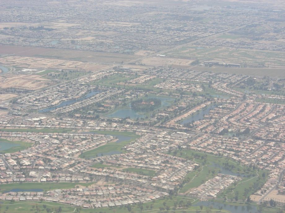
Phoenix
For those who prefer the simplicity of postwar sprawl to the messy inward-turn of most major American cities in recent years, Phoenix has you covered. The city has seen virtually no densification in recent years, instead sprawling farther outward into the desert in a visualization that creator Ian Rees likened to a cellular automaton, replicating outward without any return to the core.
Time will tell, however, if the city continues to imitate its postwar sprawl in this decade, or if a new light rail line will recenter growth in the core.
I’ll have more city GIFs, including Washington, D.C. and Boston, soon.
The Works is made possible with the support of the Surdna Foundation.
Stephen J. Smith is a reporter based in New York. He has written about transportation, infrastructure and real estate for a variety of publications including New York Yimby, where he is currently an editor, Next City, City Lab and the New York Observer.