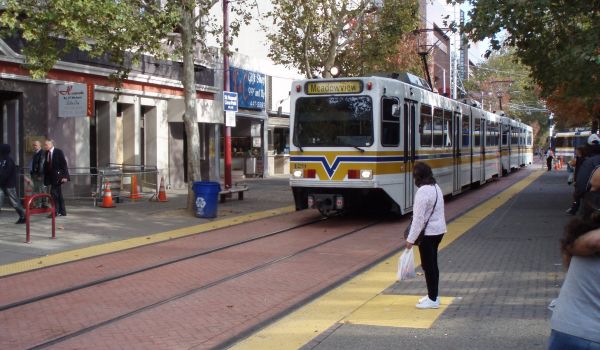
A year after the Massachusetts Bay Transit Authority was inaugurated in 1964, the agency decided to assign each of its four rapid transit lines a color. The reasoning went that different hues would help users navigate the system, and would symbolically represent the city: The Red Line travels through Harvard, the Blue Line travels beneath the Boston Harbor and so on.
Recently, Ari Ofsevit, a transportation engineering and urban planning graduate student at MIT— and frequent rider of the MBTA — got to thinking about these same colors. Ofsevit noticed that the agency’s Twitter alert colors didn’t match the colors the agency uses on maps and signage.
“I made a quick swatch comparing the colors and realized this would be a good way to do something I’d been thinking about doing for a while: comparing various subway colors,” Ofsevit says. “It kind of snowballed from there.”
The resulting graphic he tweeted out last week shows the colors used by 13 transit systems in the U.S. and Canada that use at least three colors, two of them from subway lines. Primary colors are well represented, with the most commonly used colors being blue, green, red, orange and yellow. The graphic was created using PDF maps, a color picker and a line file.
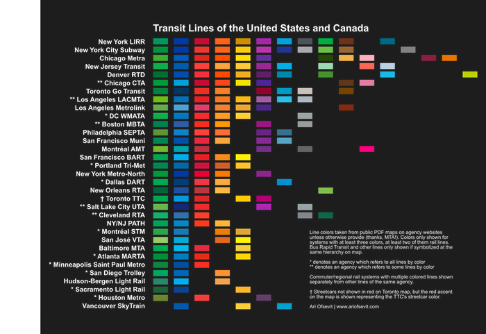
Ofsevit was surprised at the attention the graphic received; he says he tweeted it out for his “own amusement.” With a big response, though, he crowdsourced comments, edits and suggestions on Twitter, and posted updated versions based on feedback.
As one viewer pointed out, the prevalence of red and green in transit systems could cause problems for color-blind transit users.
.@ofsevit @transitmap Transit line colors with a red-green color blindness. pic.twitter.com/qEtGWveK1l
— Sim Daltonism (@simdaltonism) March 23, 2017
A more ambitious project is now forthcoming: a color-coded metro map for the world, which will only include metro systems with at least four lines. A plan to turn the maps into posters is also in the works, and Ofsevit launched a Kickstarter to see if there’s enough interest for higher-quality posters to make sense. He’s posting prototypes to the fundraising page throughout the process, and sees the platform as a way to continue to crowdsource edits like he did on Twitter.
“I like to think I know a lot, but certainly not everything,” he says.
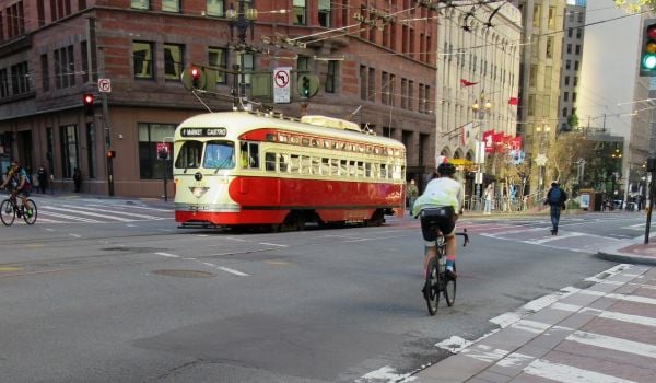
On a similar note, Greater Greater Washington posted a graphic recently noting the prevalence of certain colors in U.S. rail, light rail or streetcar systems. Stephen Hudson notes at GGW that most transit systems do use colors whether or not those are included in the name of the lines. San Francisco’s BART system, for example, color-codes its lines on maps using blue, green, orange, red and yellow, but the lines themselves are named after their stations, such as the Daly City–Dublin/Pleasanton line.Hudson also notes the disadvantages of naming lines after colors. They can be confusing to those not familiar with the system, and have their limitations.
“Using line colors in New York would also be impractical, as there are simply too many lines,” Hudson writes. “After eight or so lines, using colors for each different route becomes impractical as there are no longer primary or secondary colors left to use for names.”
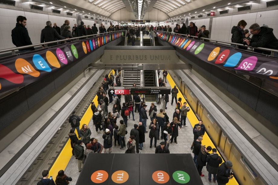
And of course, color-coding doesn’t always stop at trains. At least in NYC’s subway, the tile also used to be color-coded so people could know when to transfer just by looking at the walls of the station.
While Ofsevit says he’s creating his transit maps mostly for fun (he’s previously also created a trail map in the style of a subway map) he says the maps could help connect people to their local transit systems and to their city.
“Transit connects people to a place, and they identify with it,” he says. “Look at Cubs fans walking around with T-shirts which say ‘Addison’ or people in New York with posters which are just the round ‘bullet’ of a train. It’s neat that transit can connect people not only physically, but in this manner as well.”
Kelsey E. Thomas is a writer and editor based in the most upper-left corner of the country. She writes about urban policy, equitable development and the outdoors (but also about nearly everything else) with a focus on solutions-oriented journalism. She is a former associate editor and current contributing editor at Next City.