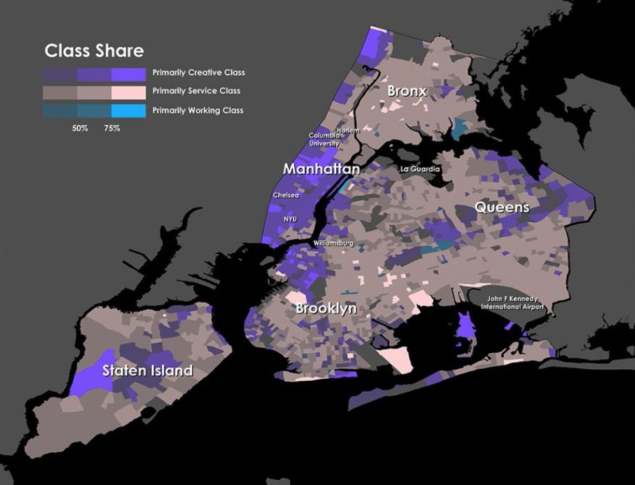
Urban advocates tend to fetishize maps. We do this because they act as windows to the soul of cities. Yesterday, the Martin Prosperity Institute, urban guru Richard Florida’s think tank, released a report full of maps offering a new lens to look at cities through. “The Divided City and the Shape of the New Metropolis” uses census data to highlight residential neighborhoods in U.S. by class.
Forgoing long-used terms of class (affluent upper class, middle-class professionals, and struggling lower class), Florida splits three different populations into the “creative class” (for newbies, the professional, “knowledge-based” sector of tech workers, white-collar professionals, healthcare and legal workers); the “service class,” who work in low-skill, low-wage jobs; and the blue-collar “working class” of factory, construction and transportation workers.
Whatever the labels, the maps reveal a familiar American storyline: There is bleak urban class inequality. On its own, it’s an updated look at where the haves are living in contrast to the have-nots in the most populous cities. If the maps are compared to others that factor in race, income, job availability and transit, “The Divided City” has the potential to reveal a lot about the way that structural inequality and rapid gentrification operate via the workforce sector. Looking at these layers side-by-side, we might begin to see which Americans settle in specific neighborhoods by choice and which migrate by default — and what social or ethnic backgrounds have to do with it.
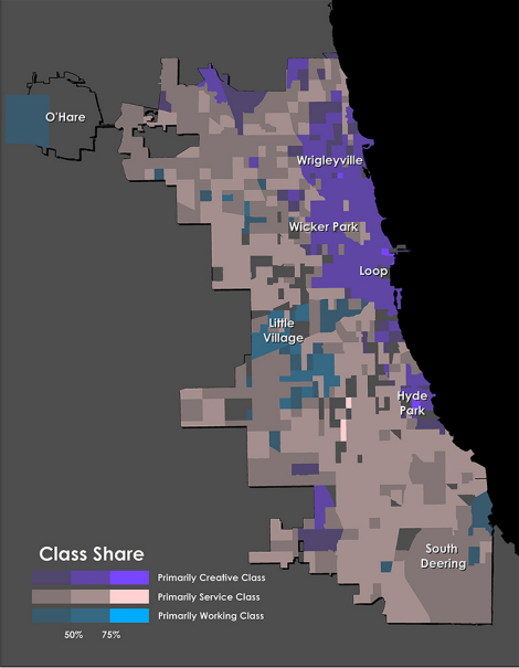
The report’s look at Chicago (Source: The Martin Prosperity Institute)
This new way of modeling the city shares a sense of purpose with the classic models of the city put forth by modern urban theorists (the Chicago School’s concentric zones, Homer Hoyt’s sector model, and Harris and Ullman’s multiple nuclei model). The shapes are different and they reflect different time periods, but they ultimately aim to show how class “is inscribed on our very geography,” as Florida’s report puts it.
The new study finds that the creative class occupies the most desirable spaces of cities. Further, the locations of the service and working classes “are structured and shaped by the locational prerogatives of the creative class.”
While the settlement whims of the affluent definitely have an impact on whether neighborhoods become trendy (glimpse the evidence in these before and after photos of New York’s Meatpacking District), the report’s conclusion doesn’t capture some important variables at play.
Government intervention often plays a catalyzing role that isn’t captured in these maps. Zoning changes, special districts (like historic districts and business improvement districts), and the lurking scars of discriminatory practices (like redlining, urban renewal and the siting of public housing) all influence — and in some cases, define — settlement patterns.
A waterfront doesn’t just transform from a neighborhood of dockworkers to an enclave of tech workers because of creative class groupthink. Governments and powerful business interests use tools to promote economic development, and these tools have sometimes marginalized whole groups of stakeholders. As a co-chairman of a campaign to landmark an already scaling-up swath of the Meatpacking District put it in 2001, “Save Gansevoort Market is not to stop gentrification. … It’s to preserve the character of the place.”
“The Divided City” puts it this way: “Recent efforts to open up Manhattan and Brooklyn riverfronts have resulted in new creative class clusters in those neighborhoods. In many cases, waterfronts have been reclaimed from industrial uses and provide the additional advantages of close proximity to the urban core and an abundance of warehouse buildings that can be repurposed as loft offices and housing.” This framing leaves out agents of change more powerful than the worker bees of the creative class. One man’s “reclamation” might be (or, is often) another man’s displacement by policy change.
Other conclusions of the report prove commonplace, though slightly disturbing. Take the idea that the creative class tends to cluster in cities around transit. While taking advantage of one of cities’ greatest amenities, the relatively affluent are a group least in need economically of taking advantage of public transportation.
Comparing maps in “The Divided City” to maps of race and income is illuminating. In Florida’s Chicago map, above, pink indicates primarily service class areas, and they correspond to primarily African-American neighborhoods (seen in this Justice Map image of Chicago’s population, below).
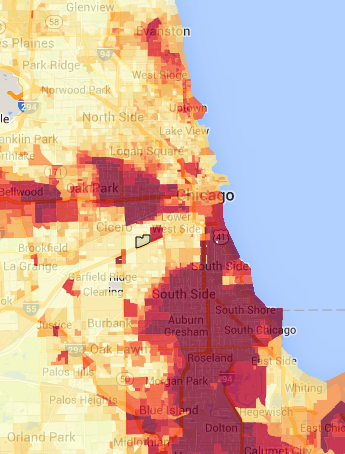
Chicago’s African-American population (Source: Justice Map)
According to the report’s map, the neighborhood of Little Village is the main cluster of working class residents in Chicago. Little Village is known as the “Mexico of the Midwest” and is 82 percent Latino (seen in the map below). If you look at the report’s other areas defined as working class (like in Philadelphia and Houston), they correspond to those cities’ large Latino populations. The report says, “There are very few remaining working class clusters [in American cities], and the ones that remain are also largely pushed to the peripheries.” This might inspire the thought of white ethnic labor union stalwarts picking up and moving to a different part of town. But maybe instead, a new Mexican immigrant class is taking those factory and construction jobs and choosing to settle in a place with cultural familiarity (in addition to cheap rent). Further research would confirm which narrative(s) are at play.
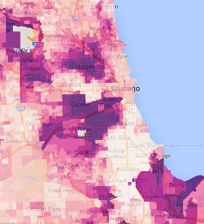
Chicago’s Hispanic population (Source: Justice Map)
“The Divided City” addresses recent scholarship on persistent poverty and concentrated disadvantage in cities. It uses work like Patrick Sharkey’s Stuck in Place to shape the report’s analysis. But looking once more at the Chicago map, the black or Latino creative class could be rendered out of view, unseen within the areas identified as predominately service class.
As the Urban Institute (and Ta-Nehisi Coates) point out: “The average high-income black person lives in a neighborhood with a higher poverty rate than the average low-income white person.” If we continue to “read the tea leaves” within “The Divided City,” we could unpack more about the interrelations between occupation, concentrated poverty, race and geography.
The Equity Factor is made possible with the support of the Surdna Foundation.

Alexis Stephens was Next City’s 2014-2015 equitable cities fellow. She’s written about housing, pop culture, global music subcultures, and more for publications like Shelterforce, Rolling Stone, SPIN, and MTV Iggy. She has a B.A. in urban studies from Barnard College and an M.S. in historic preservation from the University of Pennsylvania.