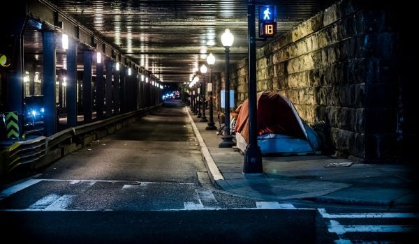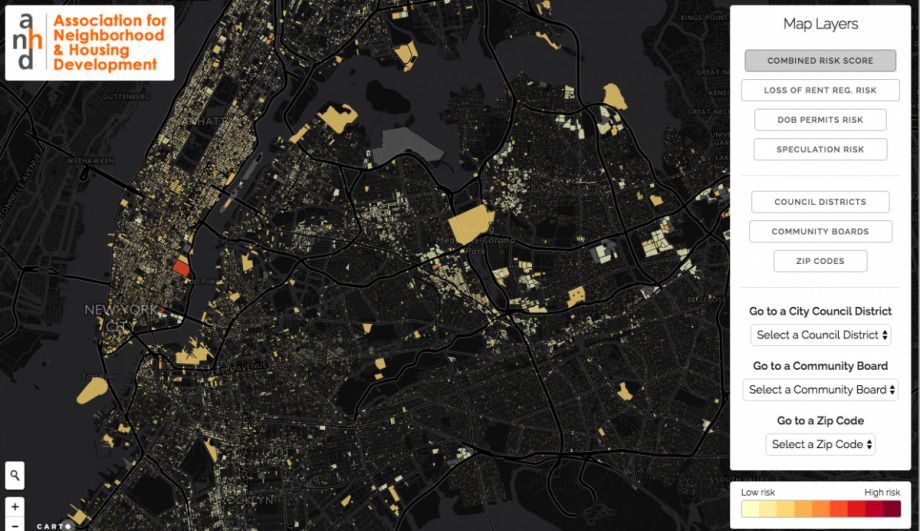
A new map from the Association for Neighborhood and Housing Development (ANHD) shows where tenants may be facing the most significant displacement pressures cross NYC and where affordable housing is most at risk. The Displacement Alert Project Map shows a risk factor for 96,000 buildings based on three groups of data: the loss of rent-regulated units in the building, a high rate of tenant turnover (as indicated by NYC Department of Buildings permits), and the price the building sold for, which can indicate speculative building purchases.
Each set of data is on a scale of 100, so the closer an individual building’s score is to 300, the greater the displacement risk. Users can click on an individual building or search by address to see the score for each data set and find out more details about why a given building is at risk.
While more aggregated data is to come, there are already a few findings. Each building in the data set has at least one indicator of potential displacement concern, and over half of buildings on the map have a high-risk score. The city has also lost more than 156,000 rent-regulated units from 2007 to 2014, and last year the sales price per unit more than doubled the 2010 area average for at last 5,400 buildings.
The creators of the DAP Map say the data could empower tenants and housing activists, and could help officials create government displacement policies that match current neighborhood trends.
“New York’s housing crisis is made worse by compounding issues of inequality and segregation of neighborhoods,” said Council Member Jumaane D. Williams in a statement. “The data … will help address issues that disproportionately affect low-income New Yorkers and black and brown communities.”
The project was funded by the Mertz Gilmore Foundation and the Ford Foundation (the Ford Foundation provides grant funding to Next City). Last year, ANHD also released an interactive map of the economic development by neighborhood.
Kelsey E. Thomas is a writer and editor based in the most upper-left corner of the country. She writes about urban policy, equitable development and the outdoors (but also about nearly everything else) with a focus on solutions-oriented journalism. She is a former associate editor and current contributing editor at Next City.