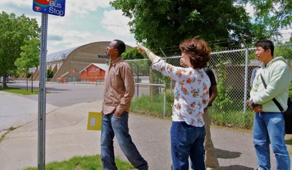
Commonly, areas that lack access to transit are labeled “transit deserts,” in reference to the more commonly-discussed food deserts. A new tool from the Center for Neighborhood Technology deliberately eschews that label.
“Transit is intrinsically different than food,” the AllTransit Gap Finder website states. “A given location could have no transit and that might be okay, for example a rural area where the population is so dispersed that running a transit service would not make sense.”
The tool takes a different approach, examining the gap between a neighborhood’s market for transit (how many people actually could use a ride, based on demographic info) and the actual service provided. That approach — pairing demand with service — gives transit wonks more to work with than your typical data-set showing strong (or weak) public transportation.
“The goal is to understand where transit need is being met” and where it isn’t, Zak Accuardi of TransitCenter (which funded CNT’s work), recently told Streetsblog.
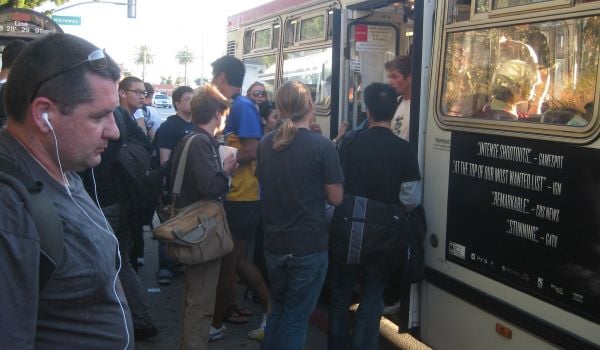
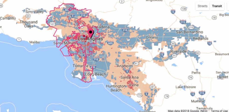
On a city-to-city level, the information presented by the tool isn’t that surprising. Philadelphia is a sea of blue, the color denoting adequate service, while Los Angeles is a mix of blue with pink and red, signifying inadequate service in both medium and high transit markets.
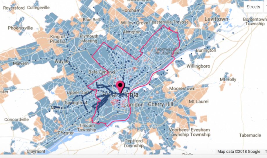
(Credit: AllTransit Gap Finder)
In the denser east coast city, about 16 percent of households are underserved by transit. In the notoriously spread-out California city, that figure jumps to 71.3 percent.
While the tool is interesting (and potentially useful) in its implications for local advocates and policy makers, as Streetsblog points out, the maps shouldn’t be viewed as the last word on where transit is needed most:
The transit data the maps are based on comes from posted schedules, not real time data. So routes where agencies run a lot of buses but service is slow or unreliable because of traffic congestion won’t get flagged, for instance. Nor do the maps account for barriers to walkability like highways that may make dense areas appear more well-suited for transit than they really are.
The tool is available here.

Rachel Dovey is an award-winning freelance writer and former USC Annenberg fellow living at the northern tip of California’s Bay Area. She writes about infrastructure, water and climate change and has been published by Bust, Wired, Paste, SF Weekly, the East Bay Express and the North Bay Bohemian
Follow Rachel .(JavaScript must be enabled to view this email address)