United Nations’ projections for the explosion of Earth’s human population in the next century are monopoly-money high. We’re at seven billion and according to the UN, we’ll soon hit 11 billion. The numbers, impossible to comprehend, feel fake. Will the difference even be noticeable? Will all landmasses on Earth be packed to the point of humans tipping over and falling into the sea? What will this massive population growth look like? And what will it mean for our future cities?
To help answer this question, Terreform ONE [Open Network Ecology], a philanthropic ecological and architectural design group from Brooklyn, is hosting a “micro-exhibition” in Manhattan from May 26 to 31. A panel of Terreform One staffers on the 28th aims to reveal “a series of exploratory and radical proposals” to plan for smart cities in the wildly populated future. Proposals will “address the ecologies of cities, systems and objects at a number of different scales and incorporate contemporary bio-design methods.”
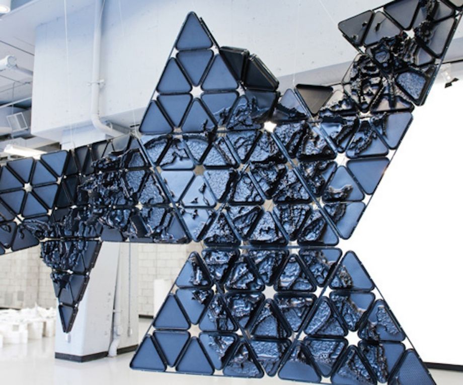
The main item on display at the exhibition will be the second iteration of Terreform’s 2013 Bio City Map, a 15-by-9-by-3-foot, three-dimensional world map made out of parametric thermoformed styrene plates, ultraviolet LED lighting strips, carbon fiber rods, and live, transgenic, glowing E. coli. Obviously.
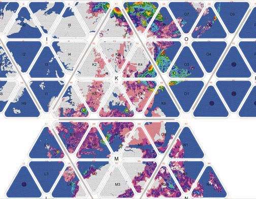
The original Bio City Map focused on current and projected populations for 25 megacities, with the front showing population density as a parametric graph. (“That means taking two-dimensional data, and displaying it in three dimensions,” explains Terreform’s Mitchell Joachim.) The back of the map represents population data with billions of cells of color-coded glowing E. coli bacteria. Why E. coli? Because as a statement on the Terreform website explains, they “expect to narrow the gap between idealized mathematical interpretations and observable events in nature.”
They may sound a bit stoned, but they’re onto something; it’s a remarkably effective data-visualization tool.
The Bio City Map isn’t immediately recognizable as a world map because they used Buckminster Fuller’s Dymaxion world map projection in which the continents are one connected landmass floating in the ocean. According to the Buckminster Fuller Institute, the American architect wanted an alternative to “traditional world maps [that] reinforce the elements that separate humanity and fail to highlight the patterns and relationships emerging from the ever-evolving and accelerating process of globalization.”
In the same spirit, Terreform chose not to label the cities, nor in fact, any other geopolitical boundaries on their original map. They wanted to show population density as an “all-encompassing” phenomenon, for their map to visualize the Earth “as one entire urbanized place, instead of unconnected settlements, municipalities and disparate regions.”
(Credit: Terreform ONE [Open Network Ecology])
The map’s most obvious takeaway is a vision of Earth as a series of grand, continuous urbanized swaths. (The second-most visually striking feature, as Joachim notes, is that “most of the world’s population will fall into a small part of one hemisphere, most of India and coastal China.”)
Since they first created the map, Terreform’s Melanie Fessel says, “the research has shifted towards a multitude of global issues including energy.” Buckminster Fuller developed an idea for a global energy grid using his original Dymaxian map, and now with the second version of the Bio City Map, Terreform is picking up where he left off. They have built a physical model of what a global energy grid could look like based on the global population growth projections, the locations of megacities and new massive urbanized areas, and the locations of potential places to harvest renewable energy.
“Can we link the various potentials for renewable energy in different places into one grand energy plan and have free unlimited energy for everyone on Earth forever?” Joachim asks rhetorically. “Yes, it’s totally theoretically possible.” He concedes that the small detail about getting nations on the same page to build the actual infrastructure would be a different story. But just the assertion that this is a concrete possibility is subversive and a political statement that suggests an embarrassing pettiness in our current global priorities.
There is a pun built physically into the map. Terreform used billiard racks to create the triangular modules of Fuller’s Dymaxion model. “We see population as a game,” Joachim says, “between us and the Earth’s metabolism. It’s about how we constantly expect our growth without limits and the consequence is that the resources will be more limited. If we continue to grow without limiting our resource consumption, we will defile the Earth as we know it.”
So how would Fuller/Terreform’s proposed global energy system work? It would harvest biomass from Central Europe, wind energy from all coasts, solar power from around the equator, geothermal from the world’s deep wells, and others — all — of the renewable energy sources all over the planet and connect those energy sources to the urbanized areas that consume. More infrastructure would be built in areas of higher population projections. The half of the Earth lit by the sun constantly powers the half in the dark. “It’s a switchable fabric in a global integrated grid that allows the production of energy without taxing the Earth’s metabolism,” explains Joachim.
Terreform argues that we “cannot view the effects of planetary population density through the lens of just one city or region.” The map’s thesis seems to be that we’re all in this together and that we better plan accordingly. Like Buckminster Fuller once said, “There is one outstandingly important fact regarding Spaceship Earth, and that is that no instruction book came with it.”
The Science of Cities column is made possible with the support of the John D. and Catherine T. MacArthur Foundation.

Zoe Mendelson is a journalist in Mexico City campaigning for a more chiller world. Her work has been featured on Fast Company, Buzzfeed, Untapped Cities and elsewhere.
Follow Zoe .(JavaScript must be enabled to view this email address)