First President Obama gave a series of speeches under structurally deficient bridges. Then, former Transportation Secretary Ray LaHood dramatically told “60 Minutes,” “Our infrastructure is on life support.” As both the U.S. Highway Trust Fund and state-by-state gas taxes remain stuck in a game of political ping-pong, officials charged with maintaining our taxed systems are finding increasingly creative ways to visualize the gridlock. After all, a picture is worth a thousand wonky words like “infrastructure,” which — numerous sources have pointed out — isn’t very sexy.
A new website from the Chicago Metropolitan Agency for Planning (CMAP) accomplishes this feat beautifully, turning piles of regional statistics into clean-but-sharp interactive maps. Designed in-house with development consulting from Clever°Franke, the site cost around $82,000 to create, according to CMAP spokesperson Tom Garritano.
“Data rules the world, and I don’t think that’s going to end, ever,” he says, explaining the organization’s motivation. Formed in 2005, the regional planning agency was a merger of transportation and land use authorities, both of whom were “keepers” of the figures for decades. Nearly 10 years ago, technology to build a digital representation didn’t exist, but now, Garritano explains, “we want to be as transparent as we can with public data.”
But the site isn’t just an exercise in open data — an area in which Chicago has been a leader among U.S. cities — it’s also an appeal to the lawmakers and voters who use Chicago’s regional system.
“Nationally and in the state, there’s a problem with the shortage of transportation funding,” Garritano says, citing the Trust Fund and motor fuel tax lag. But, Illinois voters just elected a new general assembly and governor, and, for the state at least, a capital improvement program could be on the legislative table.
“We think the public will support investment if they have confidence that it will be made with quantifiable benefits in mind,” he says.
So how, exactly, does the website “quantify” what needs to be fixed?
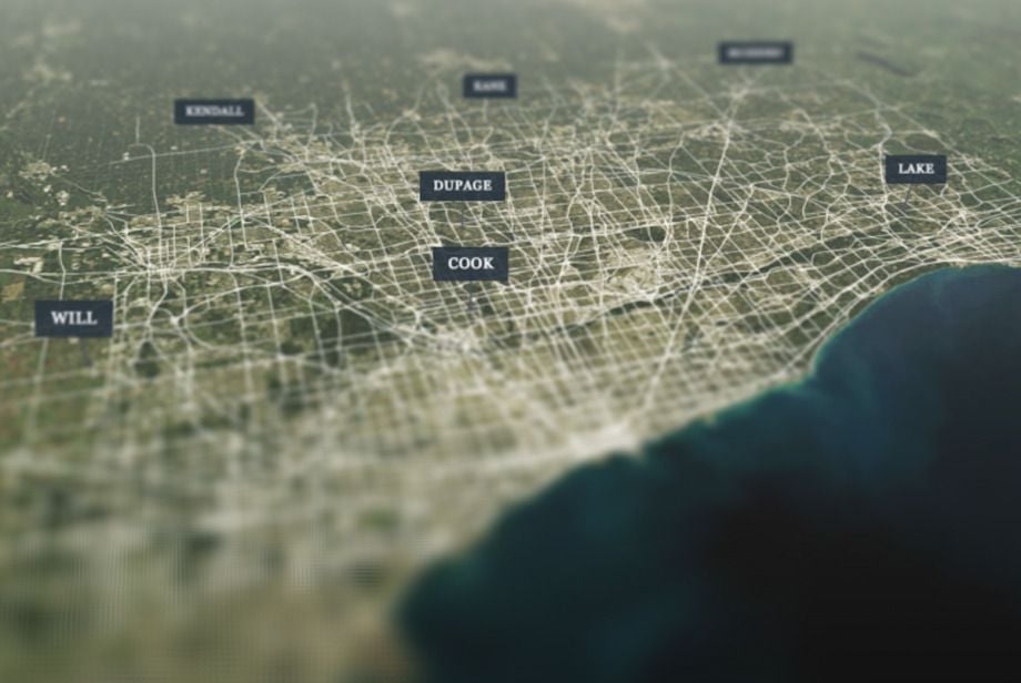
Go to the homepage and you’ll be greeted with a spinning, seven-county grid. From there, you can navigate to a toolbar showing roads, transit and freight.
Under the different modal categories, designers outlined regional pain points in gorgeous (though, occasionally, confusing) detail. One page shows the highest clusters of transit ridership along various lines.
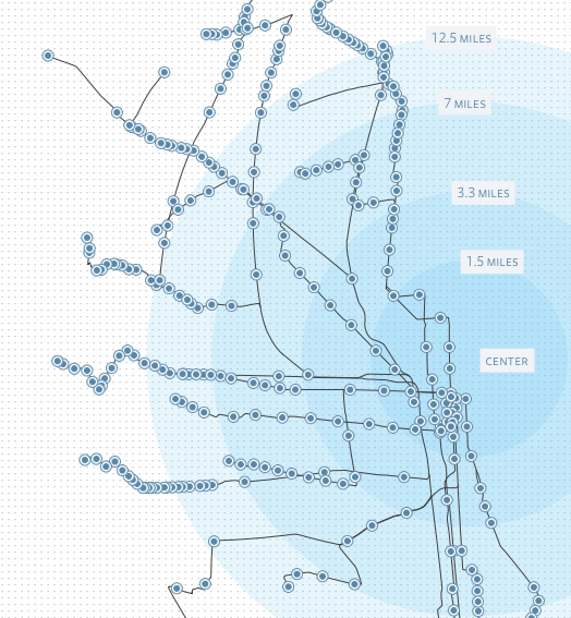
Ridership (Credit: CMAP)
Another shows access to public transportation. You can see an astonishing grid of 3,438 bridges — 302 of them labeled structurally deficient — and bright red rail crossing delays pockmarking the region like an infectious disease.
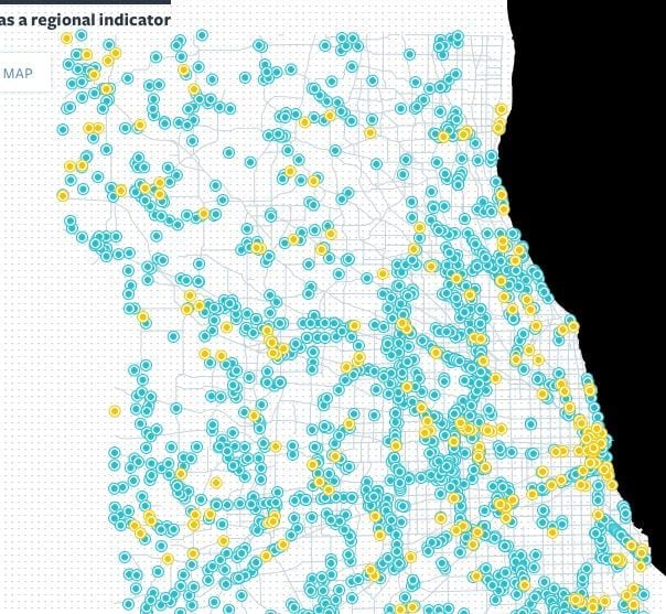
Bridge condition (Credit: CMAP)
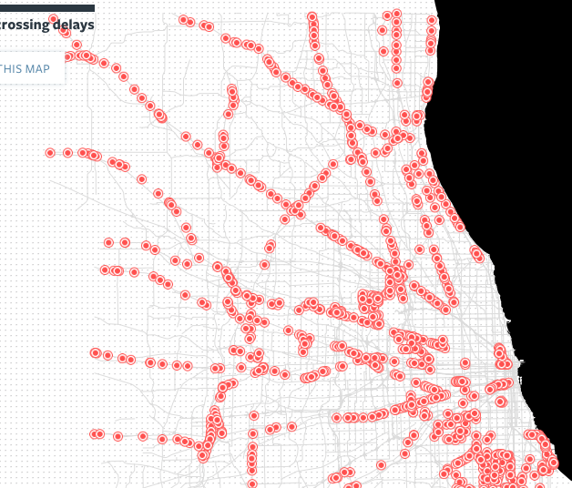
Rail crossing delays (Credit: CMAP)
For the most part, the site’s incredible precision is a plus. Scrolling over more than 3,000 bridges to see dates of construction going back over a century really helps underline the need for upgrades. The Transit Access page, which illuminates walkability along with frequency and connectivity, also gives a clear and lasting impression of the region’s built inequities.
Sometimes, though, the sheer amount of data becomes overwhelming. The Ride Quality page for example, slices information by both type of road and year and then displays its quality with a scale of nine differently sized dots. It is, admittedly, better than spending any amount of time with the International Roughness Index, but feels a bit more wonky than sleek, bowing to government’s priority with micro-detail rather than Web 2.0’s motto of user-centrism.
But overall, the tool accomplishes CMAP’s goal. The list of sources is so long it could probably benefit from page breaks, but still, the site manages to be engaging.
According to Garritano, the agency didn’t turn to maps for their trendy crowd appeal. Increasingly the selfies of the data world, capturing and displaying every little detail no matter how mundane (countries by the shape of their electrical sockets?), maps seem like a perfect visualization strategy. If they can make you care that Americans drink more milk than Canadians (apparently), surely they can convince lawmakers to fund infrastructure upgrades.
But Garritano says the data simply lent itself to mapping.
“In the past you needed to have special software, and it existed in a map form,” he says. Laying it out in a series of interactive, spatial formats just made sense.
But mapping is especially helpful for displaying what he calls “a regional perspective.” The tool allows you to stand back and watch the area’s roads, bridges, trains and buses with a satellite’s-eye view, tracing them through time and space, and observing how they sync up — or, at least, how they could.
As Garritano puts it: “We want the general public, the news media and decision-makers to think about the system as a whole.”
The Works is made possible with the support of the Surdna Foundation.

Rachel Dovey is an award-winning freelance writer and former USC Annenberg fellow living at the northern tip of California’s Bay Area. She writes about infrastructure, water and climate change and has been published by Bust, Wired, Paste, SF Weekly, the East Bay Express and the North Bay Bohemian
Follow Rachel .(JavaScript must be enabled to view this email address)