Before community activists can tackle issues like income inequality, residential segregation and environmental racism, they first have to identify the extent of the problem they hope to address and the scope of its impact on stakeholders. While the federal government is good at compiling a variety of demographic data for public use, finding the tools to make sense of it requires money, technical expertise and often a little bit of both.
A 38-year-old Philadelphia activist with a background in data visualization wants to bring that power to the people with a free interactive mapping tool that provides unprecedented insight into the racial and socioeconomic composition of the United States.
With the aid of $10,000 in funding from the Sunlight Foundation, approximately 10 GB of data from the 2010 Census and a proficiency in Google Maps, Aaron Kreider spent a year generating millions of high-resolution map tiles to create JusticeMap.org — which enables users to represent race and income data in visually compelling digital maps that can be annotated and exported.
“I’ve zoomed deeper in the data than other people have done before,” said Kreider, explaining that Justice Map is the first tool of its kind to map race and income data down to street level. “There are something like 10 million individual blocks in the United States. I was running my computer through the night.”
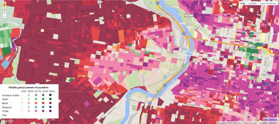
West Philadelphia race plurality map (Source: Justice Map)
Kreider, who studied sociology in graduate school at Notre Dame, says his decision to focus on race and income stems from his background as a web developer for the Energy Justice Network, where he created software that enabled the group to map more than 10,000 power plants and waste facilities across the U.S.
“Often what happens with these kinds of facilities is the location is biased, and they tend to be put into low-income communities and communities of color,” he said. “So coming out of an environmental background I found these variables useful and I decided to make a general tool out of one that was geared for our organization.”
Kreider says he would like to eventually expand the tool to include immigrant status and country of origin. He’d also like to incorporate data from the 2000 Census to add dynamic mapping capabilities that show how neighborhoods change over time.
“Frankly, I ran out of funding,” he said. “I’m hoping to get additional financing.”
Though still in the early stages — Justice Map launched this summer — Kreider says he’s received positive feedback from activists (many of them friends and family) who are eager to incorporate the tool into their own projects.
One local organizer is already using the platform to measure air quality by neighborhood in Louisville, Ky., as part of beta mapping effort there; and Kreider says his brother-in-law is hoping to use Justice Map to help identify sites for new low-income housing to serve Seattle’s Latino community.
Data mapping can go a long way toward helping advocacy organizations assess and share critical information about their constituencies. The German consulting firm Crisscrossed GmbH estimates that 80 percent of data contains geo-referenced information.
In a 2010 resource guide titled “Maps for Advocacy,” the Tactical Tech Collective presents nearly a dozen case studies of organizations around the world that have leveraged mapping technology to advance social change.
“Much work done by advocacy organizations has some ‘spatial’ element to it and includes data that can, when approached creatively, be easier to explore and understand when mapped or displayed visually,” the group notes.
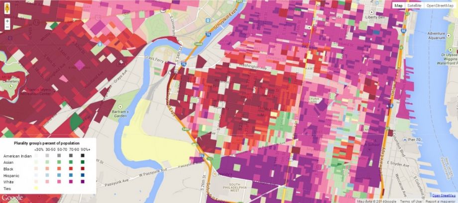
Gentrification in the Point Breeze section of Philadelphia (Source: Justice Map)
In May, the Citizens Planning Institute (CPI) in Philadelphia hosted a seminar that looked at the importance of data visualization for the development of community empowerment projects.
The CPI was launched in 2010 by Philadelphia’s City Planning Commission with a mission to help citizens “take a more effective and active role in shaping the future of their neighborhoods and of Philadelphia, through a greater understanding of city planning and the steps involved in development projects.”
Sarah Cordivano, project manager at geospatial software provider Azavea and one of several participants in the CPI class, says maps have the power to reveal hidden patterns and relationships in data.
“Geographically visualizing income data can help to reveal areas of disadvantage, which is a great way to identify locations in need of economic development,” she said. “Incorporating this mapped data into grant applications or reports can help to make a strong case for the need for increased activism and resources for community and environmental justice.”
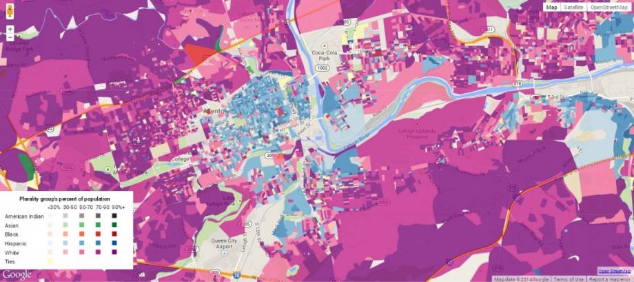
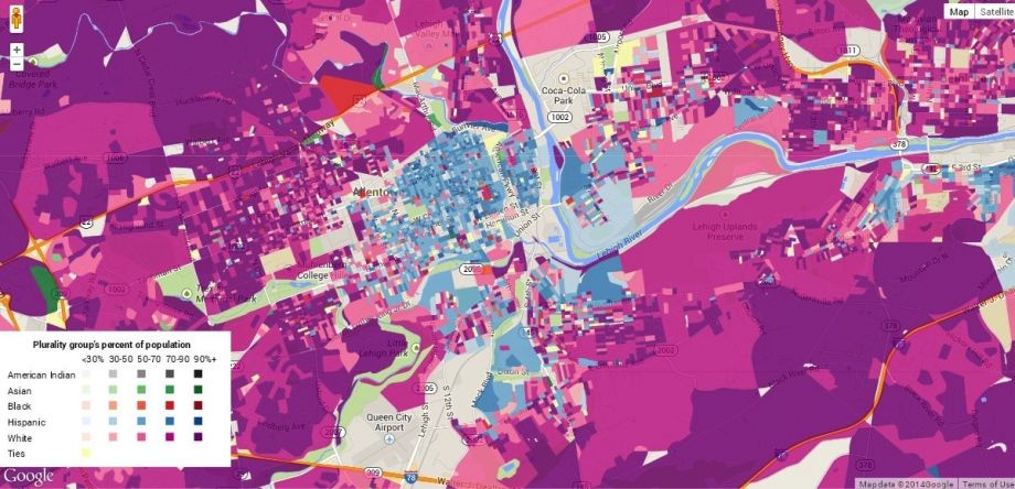
Comparing demographics of people who live near the proposed incinerator in Allentown, Pa. — percent white is only 20.8 percent within 0.5 miles, but grows to 54.9 percent at 5 miles (Source: Justice Map)
Asked what he has learned so far from digging through Justice Map data, Kreider says that perhaps his most revealing discovery is how starkly Americans remain divided by socioeconomics.
“If you look at income across America, pretty much wherever there is a group of rich people, there is a group of poor people right next to them,” he said. “Cities are known for having greater income inequality, but it’s pretty amazing to see how that dynamic extends into small towns as well.”
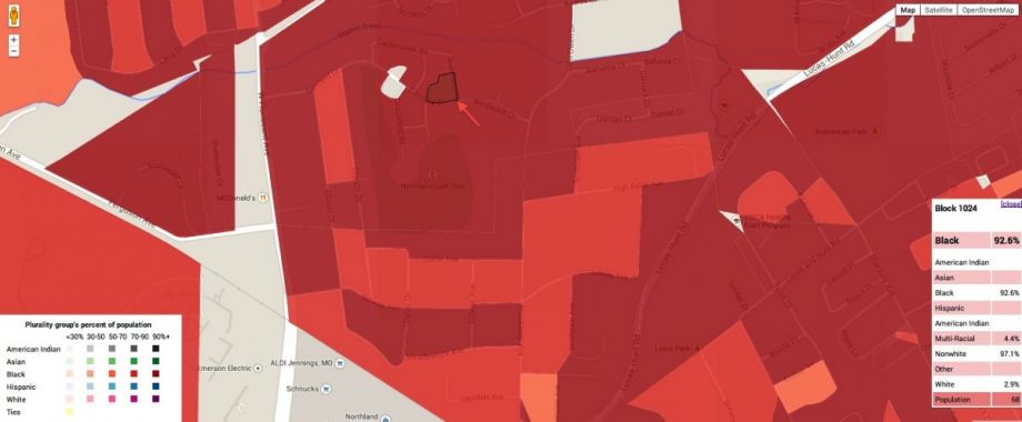
A map showing the racial composition of Ferguson, Mo., with a detail showing the 2900 block of Canfield Drive, where 18-year-old Mike Brown was shot and killed by police. (Source: Justice Map)
In the future, Kreider envisions his platform being used to power a variety of city planning initiatives — from the placement of public schools to the construction of new transit lines. He says the tool can also provide a powerful platform for journalists for visualizing racial and income inequality in cities like Ferguson, Mo., where black teen Mike Brown was recently shot and killed by a police officer.
“Any social program that is tied to location can benefit from a tool like this,” he said.
The Equity Factor is made possible with the support of the Surdna Foundation.
Christopher Moraff writes on politics, civil liberties and criminal justice policy for a number of media outlets. He is a reporting fellow at John Jay College of Criminal Justice and a frequent contributor to Next City and The Daily Beast.
Follow Christopher .(JavaScript must be enabled to view this email address)