How much economic diversity do you encounter at your neighborhood cafe or the coffee shop near work? How about at your city’s museums, retail stores, public parks or airport?
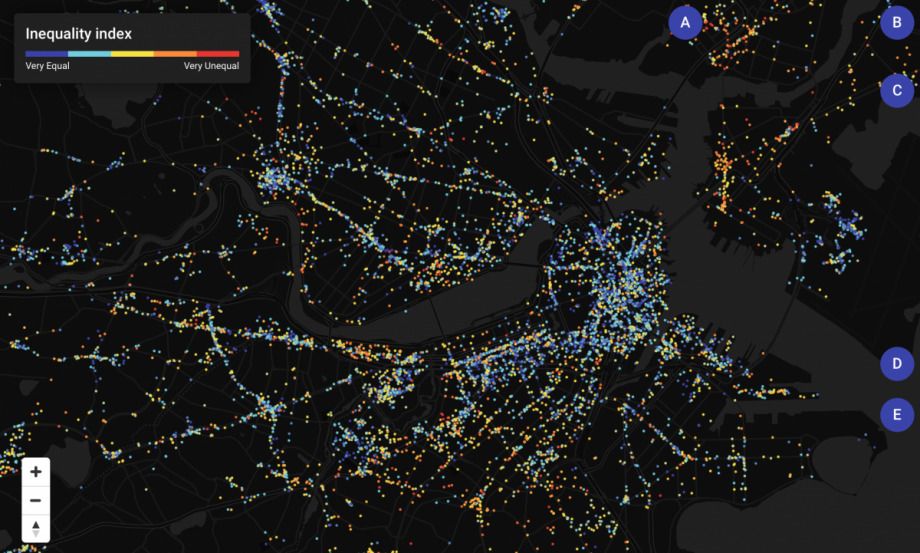
Researchers at the MIT Media Lab have created the Atlas of Inequality to dig into such questions. The interactive map of the Boston metropolitan area provides a snapshot of income homogeneity or diversity among people visiting thousands of local destinations.
Income inequality and income segregation often are discussed in terms of the neighborhoods people live in. Here, the focus is on identifying where people of different incomes do or don’t encounter one another as they move about the city to work, eat, do errands, or soak up arts and culture.
“What you see in the map is actually what people do during the day at the level of place. It allows us to see how different income groups get together,” says Esteban Moro, principle investigator for the project and visiting MIT professor from the Universidad Carlos III de Madrid in Spain.
To create the map, Moro and his team used aggregated anonymous location data gathered by Cuebiq’s Data for Good initiative over a six-month period from digital devices such as cell phones. Using census block group data, they assigned income brackets based on where people lived (guessed by gauging where they most frequently spent time between 8 p.m. and 4 a.m.). From the public Foursquare API, they extracted some 30,000 local places people visited, including public outdoor spaces, eateries, retail shops, museums and hospitals.
Each place is represented by a dot on the map, color-coded to show its level of “place inequality.” On the red end, place inequality is high, meaning that people who go there represent mainly the same income group ¾ think expensive boutique or soup kitchen. Blue dots signify the opposite: a fairly even mix of the four income groups.
For a visit to be counted, people had to spend more than five minutes at a location. Clicking a dot on Atlas of Inequality reveals the relative proportion of each income group visiting that space, shown by one to four dollar signs, along with the place’s income inequality rating.
In the Boston map, certain patterns jump out quickly. Dense downtown areas are flush with blue dots, suggesting that busy commerce and government areas put people of all income levels in close proximity. In much of East Boston, a thicket of red and orange dots shows most businesses still skewing toward low-income groups, even as an influx of luxury residential towers is changing the heavily immigrant area.
On the other hand, Logan International Airport, also in East Boston, is one of the most income-diverse locations — along with pizza place Santarpio’s, the family-run fixture beloved by an array of locals, tourists and former locals now in the suburbs.
In some neighborhoods, churches stand out as blue islands of income diversity in a sea of red- and orange-coded establishments with mainly low-income visitors.
One of the limitations of examining income levels with census data is that Boston’s large college student population could make it hard to discern the struggling low-wage resident supporting self and family from the temporarily low-income student subsidized by parents. Also, while Boston has well-known hyperexpensive areas, it also has neighborhoods of dramatic juxtaposition like the South End, in which nearly half of all housing units are designated affordable, but are intermixed with multimillion-dollar condos and brownstones. It’s not clear whether income data for census block groups, which Moro says contain 1,000 to 4,000 people in Boston, can tease out such microgeographical distinctions.
One South End story the Atlas of Inequality tells is that within the Villa Victoria affordable housing community, an arts center draws people of diverse incomes, earning it a low 23.6 percent inequality rank.
Another question is whether GPS can capture location accurately for densely packed establishments, such as the area around Berklee College of Music with its blocks of tiny adjacent restaurants. Moro notes that typical GPS accuracy can pinpoint locations within 10 meters, and that the typical distance between points is 39 meters.
With GPS limits in mind, the map’s usefulness may rise as the dots become farther apart. In Cambridge, following Massachusetts Avenue out past Harvard Square, low inequality is seen in live music clubs, gas stations and even a Dunkin’, while a tiny women’s clothing boutique skewed heavily toward the highest income group. One of the lowest-inequality establishments in the area is Frank’s Steakhouse, established in 1938.
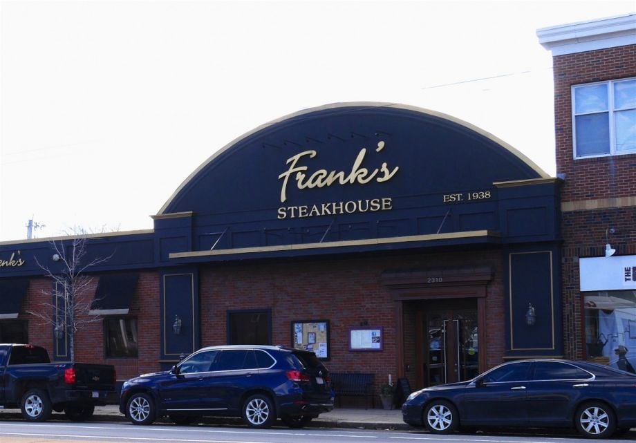
According to Atlas of Inequality data, Frank's Steakhouse, established in 1938 in Cambridge, is a place where there are often people of various income levels. (Photo by Sandra Larson)
About 10 new people per minute are using the Atlas of Inequality, Moro says. The researchers invite feedback and are awash in emails already, with users posing questions, reporting problems or telling stories about the map’s places.
One frequent question is about something the map cannot do: distinguish between employees and visitors at a location. A mix of incomes at a restaurant could simply reflect affluent diners and low-earning staff.
Moro says this is not necessarily a problem, suggesting that coming together at all is better than total separation.
“It’s true that people who spend most of the day there are employees, and visitors are a fraction of the people there,” he says. “We didn’t want to split it, because we feel that work is one of the main drivers of equality, [an activity that] gets you exposed to other people.”
More Inequality Maps to Come
The Boston map is just a start, with 10 other U.S. metro areas to follow. New York City’s map is next, due out in late March. Moro envisions the project not only growing to cover more cities and countries, but evolving from static to dynamic, providing capacity to study and predict changes over time.
Even as a static glimpse, the model could help planners understand how mixed or exclusive a city’s public, retail and institutional spaces are now. As Next City has reported, public areas from rail trails to dog parks are gaining scrutiny for how well or poorly they serve a diversity of users, and how they may be harbingers of gentrification and displacement.
In Boston, growing income inequality is a serious and continuing issue for city leaders, experts and advocates, not to mention those on the ground feeling the pain of untenable rents as luxury developments encroach on formerly affordable neighborhoods. With the tool revealing low-inequality arts centers and restaurants popular across the income spectrum, city officials could work on support systems that keep such institutions from being priced out by rising rents or shuttering when aging owners retire or fall ill.
The map clearly is not intended to prescribe that all businesses serve every income level. Rather, it might inform city efforts to maintain a healthy mix of establishments and monitor whether public spaces are actually attracting and welcoming a broad spectrum of visitors.
“I’m not saying 100 percent equality is the right thing, just that 100 percent inequality is the wrong thing,” Moro says. “With 100 percent unequal places in the city, a city is not working, it’s just a container of different groups.”
Sandra Larson is a Boston-based freelance writer covering urban issues and policy. Her work has also appeared in The New York Times, Guardian Cities and the Bay State Banner. See her work at sandralarsononline.com.
Follow Sandra .(JavaScript must be enabled to view this email address)